A lot has changed in Seattle in the last 15 years. The area around South Lake Union, near where I lived, has been turned into a major hub for biotechnology and the life sciences. Amazon is constructing a new campus featuring giant ‘biospheres’ which look like nothing I have ever seen.
Attending the conference, though, was like a blast from the past – because unlike the models used by architects to design their space-age buildings, the models used in pharmacology have barely moved on.
While there were many interesting and informative presentations and posters, most of these involved relatively simple models based on ordinary differential equations, very similar to the ones we were developing at the ISB years ago. The emphasis at the conference was on using models to graphically present relationships, such as the interaction between drugs when used in combination, and compute optimal doses. There was very little about more modern techniques such as machine learning or data analysis.
There was also little interest in producing models that are truly predictive. Many models were said to be predictive, but this just meant that they could reproduce some kind of known behaviour once the parameters were tweaked. A session on model complexity did not discuss the fact, for example, that complex models are often less predictive than simple models (a recurrent theme in this blog, see for example Complexity v Simplicity, the winner is?). Problems such as overfitting were also not discussed. The focus seemed to be on models that are descriptive of a system, rather than on forecasting techniques.
The reason for this appears to come down to institutional effects. For example, models that look familiar are more acceptable. Also, not everyone has the skills or incentives to question claims of predictability or accuracy, and there is a general acceptance that complex models are the way forward. This was shown by a presentation from an FDA regulator, which concentrated on models being seen as gold-standard rather than accurate (see our post on model misuse in cardiac models).
Pharmacometrics is clearly a very conservative area. However this conservatism means only that change is delayed, not that it won’t happen; and when it does happen it will probably be quick. The area of personalized medicine, for example, will only work if models can actually make reliable predictions.
As with Seattle, the skyline may change dramatically in a very short time.
The title of this blog entry refers to a letter published in the journal entitled, CPT: Pharmacometrics & Systems Pharmacology. The letter is open-access so those of you interested can read it online here. In this blog entry we will go through it.
The letter discusses a rather strange modelling practice which is becoming the norm within certain modelling and simulation groups in the pharmaceutical industry. There has been a spate of publications citing that tumour re-growth rate (GR) and time to tumour re-growth (TTG), derived using models to describe imaging time-series data, correlates to survival [1-6]. In those publications the authors show survival curves (Kaplan-Meiers) highlighting a very strong relationship between GR/ TTG and survival. They either split on the median value of GR/TTG or into quartiles and show very impressive differences in survival times between the groups created; see Figure 2 in [4] for an example (open access).
Do these relationships seem too good to be true? In fact they may well be. In order to derive GR/TTG you need time-series data. The value of these covariates are not known at the beginning of the study, and only become available after a certain amount of time has passed. Therefore this type of covariate is typically referred to as a time-dependent covariate. None of the authors in [1-6] describe GR/TTG as a time-dependent covariate nor treat it as such.
When the correlations to survival were performed in those articles the authors assumed that they knew GR/TTG before any time-series data was collected, which is clearly not true. Therefore survival curves, such as Figure 2 in [4], are biased as they are based on survival times calculated from study start time to time of death, rather than time from when GR/TTG becomes available to time of death. Therefore, the results in [1-6] should be questioned and GR/TTG should not be used for decision making, as the question around whether tumour growth rate correlates to survival is still rather open.
Could it be the case that the GR/TTG correlation to survival is just an illusion of a flawed modelling practice? This is what we shall answer in a future blog-post.
[1] W.D. Stein et al., Other Paradigms: Growth Rate Constants and Tumor Burden Determined Using Computed Tomography Data Correlate Strongly With the Overall Survival of Patients With Renal Cell Carcinoma, Cancer J (2009)
[2] W.D. Stein, J.L. Gulley, J. Schlom, R.A. Madan, W. Dahut, W.D. Figg, Y. Ning, P.M. Arlen, D. Price, S.E. Bates, T. Fojo, Tumor Regression and Growth Rates Determined in Five Intramural NCI Prostate Cancer Trials: The Growth Rate Constant as an Indicator of Therapeutic Efficacy, Clin. Cancer Res. (2011)
[3] W.D. Stein et al., Tumor Growth Rates Derived from Data for Patients in a Clinical Trial Correlate Strongly with Patient Survival: A Novel Strategy for Evaluation of Clinical Trial Data, The Oncologist. (2008)
[4] K. Han, L. Claret, Y. Piao, P. Hegde, A. Joshi, J. Powell, J. Jin, R. Bruno, Simulations to Predict Clinical Trial Outcome of Bevacizumab Plus Chemotherapy vs. Chemotherapy Alone in Patients With First-Line Gastric Cancer and Elevated Plasma VEGF-A, CPT Pharmacomet. Syst. Pharmacol. (2016)
[5] J. van Hasselt et al., Disease Progression/Clinical Outcome Model for Castration-Resistant Prostate Cancer in Patients Treated With Eribulin, CPT Pharmacomet. Syst. Pharmacol. (2015)
[6] L. Claret et al., Evaluation of Tumor-Size Response Metrics to Predict Overall Survival in Western and Chinese Patients With First-Line Metastatic Colorectal Cancer, J. Clin. Oncol. (2013)
I recently published a letter with the above title in the journal of Clinical Pharmacology and Therapeutics; unfortunately it’s behind a paywall so I will briefly take you through the key point raised. The letter describes a specific prediction problem around drug induced cardiac toxicity mentioned in a previous blog entry (Mathematical models for ion-channel cardiac toxicity: David v Goliath). In short what we show in the letter is that a simple model using subtraction and addition (pre-school Mathematics) performs just as well for a given prediction problem as a multi-model approach using three large-scale models consisting of 100s of differential equations combined with machine learning approach (University level Mathematics and Computation)! The addition/subtraction model gave a ROC AUC of 0.97 which is very similar to multi-model/machine learning approach which gave a ROC AUC of 0.96. More detail on the analysis can be found on slides 17 and 18 within this presentation, A simple model for ion-channel related cardiac toxicity, which was given at an NC3Rs meeting.
The result described in the letter and presentation continues to add weight within that field that simple models are performing just as well as complex approaches for a given prediction task.
The standard way of answering this question is to ask whether the effect could reasonably have happened by chance (the null hypothesis). If not, then the result is announced to be ‘significant’. The usual threshold for significance is that there is only a 5 percent chance of the results happening due to purely random effects.
This sounds sensible, and has the advantage of being easy to compute. Which is perhaps why statistical significance has been adopted as the default test in most fields of science. However, there is something a little confusing about the approach; because it asks whether adopting the opposite of the theory – the null hypothesis – would mean that the data is unlikely to be true. But what we want to know is whether a theory is true. And that isn’t the same thing.
As just one example, suppose we have lots of data and after extensive testing of various theories we discover one that passes the 5 percent significance test. Is it really 95 percent likely to be true? Not necessarily – because if we are trying out lots of ideas, then it is likely that we will find one that matches purely by chance.
While there are ways of working around this within the framework of standard statistics, the problem usually gets glossed over in the vast majority of textbooks and articles. So for example it is typical to say that a result is ‘significant’ without any discussion of whether it is plausible in a more general sense (see our post on model misuse in cardiac modeling).
The effect is magnified by publication bias – try out multiple theories, find one that works, and publish. Which might explain why, according to a number of studies (see for example here and here), much scientific work proves impossible to replicate – a situation which scientist Robert Matthews calls a ‘scandal of stunning proportions’ (see his book Chancing It: The laws of chance – and what they mean for you).
The way of Bayes
An alternative approach is provided by Bayesian statistics. Instead of starting with the assumption that data is random and making weird significance tests on null hypotheses, it just tries to estimate the probability that a model is right (i.e. the thing we want to know) given the complete context. But it is harder to calculate for two reasons.
One is that, because it treats new data as updating our confidence in a theory, it also requires we have some prior estimate of that confidence, which of course may be hard to quantify – though the problem goes away as more data becomes available. (To see how the prior can affect the results, see the BayesianOpionionator web app.) Another problem is that the approach does not treat the theory as fixed, which means that we may have to evaluate probabilities over whole families of theories, or at least a range of parameter values. However this is less of an issue today since the simulations can be performed automatically using fast computers and specialised software.
Perhaps the biggest impediment, though, is that when results are passed through the Bayesian filter, they often just don’t seem all that significant. But while that may be bad for publications, and media stories, it is surely good for science.
A common critique of biologists, and scientists in general, concerns their occasionally overenthusiastic tendency to find patterns in nature – especially when the pattern is a straight line. It is certainly notable how, confronted with a cloud of noisy data, scientists often manage to draw a straight line through it and announce that the result is “statistically significant”.
Straight lines have many pleasing properties, both in architecture and in science. If a time series follows a straight line, for example, it is pretty easy to forecast how it should evolve in the near future – just assume that the line continues (note: doesn’t always work).
However this fondness for straightness doesn’t always hold; indeed there are cases where scientists prefer to opt for a more complicated solution. An example is the modelling of tumour growth in cancer biology.
Tumour growth is caused by the proliferation of dividing cells. For example if cells have a cell cycle length td, then the total number of cells will double every td hours, which according to theory should result in exponential growth. In the 1950s (see Collins et al., 1956) it was therefore decided that the growth rate could be measured using the cell doubling time.
In practice, however, it is found that tumours grow more slowly as time goes on, so this exponential curve needed to be modified. One variant is the Gompertz curve, which was originally derived as a model for human lifespans by the British actuary Benjamin Gompertz in 1825, but was adapted for modelling tumour growth in the 1960s (Laird, 1964). This curve gives a tapered growth rate, at the expense of extra parameters, and has remained highly popular as a means of modelling a variety of tumour types.
However, it has often been observed empirically that tumour diameters, as opposed to volumes, appear to grow in a roughly linear fashion. Indeed, this has been known since at least the 1930s. As Mayneord wrote in 1932: “The rather surprising fact emerges that the increase in long diameter of the implanted tumour follows a linear law.” Furthermore, he noted, there was “a simple explanation of the approximate linearity in terms of the structure of the sarcoma. On cutting open the tumour it is often apparent that not the whole of the mass is in a state of active growth, but only a thin capsule (sometimes not more than 1 cm thick) enclosing the necrotic centre of the tumour.”
Because only this outer layer contains dividing cells, the rate of increase for the volume depends on the doubling time multiplied by the volume of the outer layer. If the thickness of the growing layer is small compared to the total tumour radius, then it is easily seen that the radius grows at a constant rate which is equal to the doubling time multiplied by the thickness of the growing layer. The result is a linear growth in radius. This translates to cubic growth in volume, which of course grows more slowly than an exponential curve at longer times – just as the data suggests.
In other words, rather than use a modified exponential curve to fit volume growth, it may be better to use a linear equation to model diameter. This idea that tumour growth is driven by an outer layer of proliferating cells, surrounding a quiescent or necrotic core, has been featured in a number of mathematical models (see e.g. Checkley et al., 2015, and our own CellCycler model). The linear growth law can also be used to analyse tumour data, as in the draft paper: “Analysing within and between patient patient tumour heterogenity via imaging: Vemurafenib, Dabrafenib and Trametinib.” The linear growth equation will of course not be a perfect fit for the growth of all tumours (no simple model is), but it is based on a consistent and empirically verified model of tumour growth, and can be easily parameterised and fit to data.
So why hasn’t this linear growth law caught on more widely? The reason is that what scientists see in data often depends on their mental model of what is going on.
I first encountered this phenomenon in the late 1990s when doing my D.Phil. in the prediction of nonlinear systems, with applications to weather forecasting. The dominant theory at the time said that forecast error was due to sensitivity to initial condition, aka the butterfly effect. As I described in The Future of Everything, researchers insisted that forecast errors showed the exponential growth characteristic of chaos, even though plots showed they clearly grew with slightly negative curvature, which was characteristic of model error.
A similar effect in cancer biology has again changed the way scientists interpret data. Sometimes, a straight line really is the best solution.
References
Collins, V. P., Loeffler, R. K. & Tivey, H. Observations on growth rates of human tumors. The American journal of roentgenology, radium therapy, and nuclear medicine 76, 988-1000 (1956).
Laird A. K. Dynamics of tumor growth. Br J of Cancer 18 (3): 490–502 (1964).
W. V. Mayneord. On a Law of Growth of Jensen’s Rat Sarcoma. Am J Cancer 16, 841-846 (1932).
Stephen Checkley, Linda MacCallum, James Yates, Paul Jasper, Haobin Luo, John Tolsma, Claus Bendtsen. Bridging the gap between in vitro and in vivo: Dose and schedule predictions for the ATR inhibitor AZD6738. Scientific Reports, 5(3)13545 (2015).
Yorke, E. D., Fuks, Z., Norton, L., Whitmore, W. & Ling, C. C. Modeling the Development of Metastases from Primary and Locally Recurrent Tumors: Comparison with a Clinical Data Base for Prostatic Cancer. Cancer Research53, 2987-2993 (1993).
Tumour modelling has been an active field of research for some decades, and a number of approaches have been taken, ranging from simple models of an idealised spherical tumour, to highly complex models which attempt to account for everything from cellular chemistry to mechanical stresses. Some models use ordinary differential equations, while others use an agent-based approach to track individual cells.
A disadvantage of the more complex models is that they involve a large number of parameters, which can only be roughly estimated from available data. If the aim is to predict, rather than to describe, then this leads to the problem of overfitting: the model is very flexible and can be tuned to fit available data, but is less useful for predicting for example the effect of a new drug.
Indeed, there is a rarely acknowledged tension in mathematical modelling between realism, in the sense of including lots of apparently relevant features, and predictive accuracy. When it comes to the latter, simple models often out-perform complex models. Yet in most areas there is a strong tendency for researchers to develop increasingly intricate models. The reason appears to have less to do with science, than with institutional effects. As one survey of business models notes (and these points would apply equally to cancer modelling) complex models are preferred in large part because: “(1) researchers are rewarded for publishing in highly ranked journals, which favor complexity; (2) forecasters can use complex methods to provide forecasts that support decision-makers’ plans; and (3) forecasters’ clients may be reassured by incomprehensibility.”
Being immune to all such pressures (this is just a blog post after all!) we decided to develop the CellCycler – a parsimonius “toy” model of a cancer tumour that attempts to capture the basic growth and drug-response dynamics using only a minimal number of parameters and assumptions. The model uses circa 100 ordinary differential equations (ODEs) to simulate cells as they pass through the phases of the cell cycle; however the equations are simple and the model only uses parameters that can be observed or reasonably well approximated. It is available online as a Shiny app.
Screenshot of the Cells page of the CellCycler. The plot shows how a cell population is affected by two different drugs.
The CellCycler model divides the cell cycle into a number of discrete compartments, and is therefore similar in spirit to other models that for example treat each phase G1, S, G2, and mitosis as a separate compartment, with damaged cells being shunted to their own compartment (see for example the model by Checkley et al. here). Each compartment has its own set of ordinary differential equations which govern how its volume changes with time due to growth, apoptosis, or damage from drugs. There are additional compartments for damaged cells, which may be repaired or lost to apoptosis. Drugs are simulated using standard PK models, along with a simple description of phase-dependent drug action on cells. For the tumour growth, we use a linear model, based like the Checkley et al. paper on the assumption of a thin growing layer (see also our post on The exponential growth effect).
The advantages of compartmentalising
Dividing the cell cycle into separate compartments has an interesting and useful side effect, which is that it introduces a degree of uncertainty into the calculation. For example, if a drug causes damage and delays progress in a particular phase, then that drug will tend to synchronize the cell population in that state. However there is an obvious difference between cells that are affected when they are at the start of the phase, and those that are already near the end of the phase. If the compartments are too large, that precise information about the state of cells is lost.
The only way to restore precision would be to use a very large number of compartments. But in reality, individual cells will not all have exactly the same doubling time. We therefore want to have a degree of uncertainty. And this can be controlled by adjusting the number of compartments.
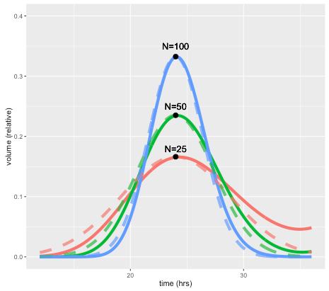
This effect is illustrated by the figure below, which shows how a perturbation at time zero in one compartment tends to blur out over time, for models with 25, 50, and 100 compartments, and a doubling time of 24 hours. In each case a perturbation is made to compartment 1 at the beginning of the cell cycle (the magnitude is scaled to the number of compartments so the total size of the perturbation is the same in terms of total volume). For the case with 50 compartments, the curve after one 24 hours is closely approximated by a normal distribution with standard deviation of 3.4 hours or about 14 percent. In general, the standard deviation can be shown to be approximately equal to the doubling time divided by the square root of N.
The solid lines show volume in compartment 1 following a perturbation to that compartment alone, after one cell doubling period of 24 hours. The cases shown are with N=25, 50, and 100 compartments. Dashed lines are the corresponding normal distributions.
A unique feature of the CellCycler is that it exploits this property as a way of adjusting the variability of doubling time in the cell population. The model can therefore provide a first-order approximation to the more complex heterogeneity that can be simulated using agent-based models. While we don’t usually have exact data on the spread of doubling times in the growing layer, the default level of 50 compartments gives what appears to be a reasonable degree of spread (about 14 percent). Using 25 compartments gives 20 percent, while using 100 compartments decreases this to 10 percent.
Using the CellCycler
The starting point for the Shiny web application is the Cells page, which is used to model the dynamics of a growing cell population. The key parameters are the average cell doubling time, and the fraction spent in each phase. The number of model compartments can be adjusted in the Advanced page: note that, along with doubling time spread, the choice also affects both the simulation time (more compartments is slower), and the discretisation of the cell cycle. For example with 50 compartments the proportional phase times will be rounded off to the nearest 1/50=0.02.
The next pages, PK1 and PK2, are used to parameterise the PK models and drug effects. The program has a choice of standard PK models, with adjustable parameters such as Dose/Volume. In addition the phase of action (choices are G1, S, G2, M, or all), and rates for death, damage, and repair can be adjusted. Finally, the Tumor page (shown below) uses the model simulation to generate a plot of tumor radius, given an initial radius and growing layer. Plots can be overlaid with experimental data.
Screenshot of the Tumor page, showing tumor volume (black line) compared to control (grey). Cell death due to apoptosis by either drug (red and blue) and damage (green) are also shown.
We hope the CellCycler can be a useful tool for research or for exploring the dynamics of tumour growth. As mentioned above it is only a “toy” model of a tumour. However, all our models of complex organic systems – be they of a tumor, the economy, or the global climate system – are toys compared to the real things. And of course there is nothing to stop users from extending the model to incorporate additional effects. Though whether this will lead to improved predictive accuracy is another question.
Stephen Checkley, Linda MacCallum, James Yates, Paul Jasper, Haobin Luo, John Tolsma, Claus Bendtsen. “Bridging the gap between in vitro and in vivo: Dose and schedule predictions for the ATR inhibitor AZD6738,” Scientific Reports.2015;5(3)13545.
Green, Kesten C. & Armstrong, J. Scott, 2015. “Simple versus complex forecasting: The evidence,” Journal of Business Research, Elsevier, vol. 68(8), pages 1678-1685.
This blog entry will focus on a rather long standing debate around model complexity and predictivity for a specific prediction problem from drug development. A typical drug project starts off with 1000’s of drugs for a certain idea. All but one of these drugs is eventually weened out through a series of experiments, which explore safety and efficacy, with the final drug being the one that enters human trials. The question we will explore is around a toxicity experiment performed rather early in the development (weening out) process, which determines the drug’s effect on the cardiac system.
Many years of research has identified certain proteins, ion-channels, which if a drug were to affect could lead to dire consequences for a patient. In simple terms, ion-channels allow ions, such as calcium, to flow in and out of a cell. Drugs can bind to ion-channels and disrupt their ability to function, thus affecting the flow of ions. The early experiment we are interested in basically measures how many ions flow across an ion-channel with increasing amount of drug. The cells used in these experiments are engineered to over-express the human protein we are interested in and so do not reflect a real cardiac cell. The experiment is pretty much automated and so allows one to screen 1000s of drugs a year against certain ion-channels. The output of the system is an IC50 value, the amount of drug needed to reduce the flow of ions across the ion-channel by 50 percent.
A series of IC50 values are generated for each drug against a number of ion-channels. (We are actually only interested in three.) The reason why a large screening effort is made is because we cannot test all the compounds in an animal model nor can we take all of them into man! So we can’t measure the effect of these drugs in real cardiac systems but we can measure their effect on certain ion-channel proteins which are expressed in the cardiac system we are interested in. The question is then: given a set of IC50 values against certain ion-channels for a particular drug can we predict how this drug will affect a cardiac system?
As mentioned earlier, drug development involves performing a series of experiments over time. The screening experiment described above is one of many used to look at cardiac toxicity. The next experiment in the pipeline, which could occur one or maybe two years later, is exploring the remaining drugs in an intact cardiac system. This could be a single cardiac cell taken from a dog, a portion of the ventricular wall, or something else entirely. After which, even less compounds are taken into dog studies before entering human trials. So the prediction question could be related to any one of these cardiac systems. The inputs into the prediction problem are the set of IC50 values, three in the cases we will look at, whereas the output, which we want to predict, are certain measures from the cardiac systems described.
At this point some of you may be thinking, well if we want to predict what will happen in a real cardiac system then why don’t we build a virtual version of the system using a large mathematical model (biophysical model)? Indeed people have done this. However, others (especially those who follow this blog) might also be thinking, I have three inputs and one output and given we screen lots of these compounds surely the dynamics are not that difficult to figure out, such that I can do something simpler and more cost effective! Again people have done this too. If I were to refer to the virtual system (consists of >100 parameters) as Goliath and the simple model (3 parameters) as David some of you can guess what the outcome is! A paper documenting the story in detail can be found here and the model used is available online here. I will just give a brief summary of the findings in the main paper.
The data-sets explored in the article involve making predictions in both animal studies and human. Something noticeable about the biophysical models used in the original articles was that a different structural model was needed for each study. This was not the case for the simple model which uses the same structure across all data sets. Given that the simple model gave the same if not better performance than the biophysical models it raises a question: why do the biophysical modelling community need a different model for different studies? In fact for two human studies, A and B, different human models were used, why? The reason may be that the degree of confidence in those models by people using them is actually quite low, hence the lack of consistency in the models used across the studies. Another issue not discussed by any of the biophysical modeling literature is the reproducibility of the data used to build such models. Given the growing skepticism of the reproducibility of preclinical data in science this adds further doubt to the suitability of such models for industrial use.
Given the points raised here (as well as a previous blog entry highlighting the misuse of these models by their own developers) can the biophysical modelling community be trusted to deliver a modelling solution that is both trustworthy and reliable? This is an important question as regulatory agencies are now also considering using these biophysical models together with some quite exciting new experimental techniques to change the way people assess the cardiac liability of a new drug.
Peer to peer lending is an option people are increasingly turning to, both for obtaining loans and for investment. The principle idea is that investors can decide who they give loans to, based on information provided by the loaner, and the loaner can decide what interest rate they are willing to pay. This new lending environment can give investors higher returns than traditional savings accounts, and loaners better interest rates than those available from commercial lenders.
Given the open nature of peer to peer lending, information is becoming readily available on who loans are given to and what the outcome of that loan was in terms of profitability for the investor. Available information includes the loaner’s credit rating, loan amount, interest rate, annual income, amount received etc. The open-source nature of this data has clearly led to an increased interest in analysing and modelling the data to come up with strategies for the investor which maximises their return. In this blog entry we will look at developing a model of this kind using an approach routinely used in healthcare, survival analysis. We will provide motivation as to why this approach is useful and demonstrate how a simple strategy can lead to significant returns when applied to data from the Lending Club.
In healthcare survival analysis is routinely used to predict the probability of survival of a patient for a given length of time based on information about that patient e.g. what diseases they have, what treatment is given etc. It is routinely used within the healthcare sector to make decisions both at the patient level, for example what treatment to give, and at the institutional level (e.g. health care providers), for example what new healthcare policies will decrease death associated with lung cancer. In most survival analysis studies the data-sets usually contain a significant proportion of patients who have yet to experience the event of interest by the time the study has finished. These patients clearly do not have an event time and so are described as being right-censored. An analysis can be conducted without these patients but this is clearly ignoring vital information and can lead to misleading and biased inferences. This could have rather large consequences were the resultant model applied prospectively. A key part of all survival analysis tools that have been developed is therefore that they do not ignore patients who are right censored. So what does this have to do with peer to peer lending?
The data on the loans available through sites such as the Lending Club contain loans that are current and most modelling methods described in other blogs have simply ignored these loans when building models to maximise investor’s returns. These loans described as being current are the same as our patients in survival analysis who have yet to experience an event at the time the data was collected. Applying a survival analysis approach will allow us to keep people whose loans are described as being current in our model development and thus utilise all information available. How can we apply survival analysis methods to loan data though, as we are interested in maximising profit and not how quickly a loan is paid back?
We need to select relevant dependent and independent variables first before starting the analysis. The dependent variable in this case is whether a loan has finished (fully repaid, defaulted etc.) or not (current). The independent variable chosen here is the relative return (RR) on that loan, this is basically the amount repaid divided by the amount loaned. Therefore if a loan has a RR value less than 1 it is loss making and greater than 1 it is profit making. Clearly loans that have yet to have finished are quite likely to have an RR value less than 1 however they have not finished and so within the survival analysis approach this is accounted for by treating that loan as being right-censored. A plot showing the survival curve of the lending club data can be seen in the below figure.
The black line shows the fraction of loans as a function of RR. We’ve marked the break-even line in red. Crosses represent loans that are right censored. We can already see from this plot that there are approximately 17-18% loans that are loss making, to the left of the red line. The remaining loans to the right of the red line are profit making. How do we model this data?
Having established what the independent and dependent variables are, we can now perform a survival analysis exercise on the data. There are numerous modelling options in survival analysis. We have chosen one of the easiest options, Cox-regression/proportional hazards, to highlight the approach which may not be the optimal one. So now we have decided on the modelling approach we need to think about what covariates we will consider.
A previous blog entry at yhat.com already highlighted certain covariates that could be useful, all of which are actually quite intuitive. We found that one of the covariates FICO range high (essentially is a credit score) had an interesting relationship to RR, see below.
Each circle represents a loan. It’s strikingly obvious that once the last FICO Range High score exceeds ~ 700 the number of loss making loans, ones below the red line decreases quite dramatically. So a simple risk adverse strategy would be just to invest in loans whose FICO Range High score exceeds 700, however there are still profitable loans which have a FICO Range High value less than 700. In our survival analysis we can stratify for loans below and above this 700 FICO Range High score value.
We then performed a rather routine survival analysis. Using FICO Range High as a stratification marker we looked at a series of covariates previously identified in a univariate analysis. We ranked each of the covariates based on the concordance probability. The concordance probability gives us information on how good a covariate is at ranking loans, a value of 0.5 suggests that covariate is no better than tossing a coin whereas a value of 1 is perfect, which never happens! We are using concordance probability rather than p-values, which is often done, because the data-set is very large and so many covariates come out as being “statistically significant” even though they have little effect on the concordance probability. This is a classic problem of Big Data and one option, of many, is to focus model building on another metric to counter this issue. If we use a step-wise building approach and use a simple criterion that to include a covariate the concordance probability must increase by at least 0.01 units, then we end up with a rather simple model: interest rate + term of loan. This model gave a concordance probability value of 0.81 in FICO Range High >700 and 0.63 for a FICO Range High value <700. Therefore, it does a really good job once we have screened out the bad loans and not so great when we have a lot of bad loans but we have a strategy that removes those.
This final model is available online here and can be found on the web-apps section of the website. When playing with the model you will find that if interest rates are high and the term of loan is low then regardless of the FICO Range High value all loans are profitable, however those with FICO Range High values >700 provide a higher return, see figure below.
The above plot was created by using an interest rate of 20% for a 36 month loan. The plot shows two curves, the one in red represents a loan whose FICO Range High value <700 and the black one a loan with FICO Range High value >700. The curves describe your probability of attaining a certain amount of profit or loss. You can see that for the input values used here, the probability of making a loss is similar regardless of the FICO Range High Value; however the amount of return is better for loans with FICO Range High value >700.
Using survival analysis techniques we have shown that you can create a relatively simple model that lends itself well for interpretation, i.e. probability curves. Performance of the model could be improved using random survival forests – the gain may not be as large as you might expect but every percentage point counts. In a future blog we will provide an example of applying survival analysis to actual survival data.
Latest book The Evolution of Money with Roman Chlupatý is published this week by Columbia University Press. Everything you need to know about money (except how to make it!).
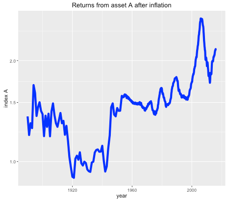
Suppose you were offered the choice between investing in one of two assets. The first, asset A, has a long term real price history (i.e. with inflation stripped out) which looks like this:
Long term historical return of asset A, after inflation, log scale.
It seems that the real price of the asset hasn’t gone anywhere in the last 125 years, with an average compounded growth rate of about half a percent. The asset also appears to be needlessly volatile for such a poor performance.
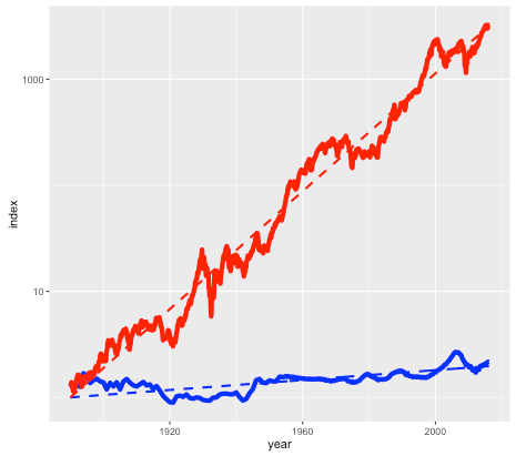
Asset B is shown in the next plot by the red line, with asset A shown again for comparison (but with a different vertical scale):
Long term historical return of assets A (blue line) and B (red line), after inflation, log scale.
Note again this is a log scale, so asset B has increased in price by more than a factor of a thousand, after inflation, since 1890. The average compounded growth rate, after inflation, is 6.6 percent – an improvement of over 6 percent compared to asset A.
On the face of it, it would appear that asset B – the steeply climbing red line – would be the better bet. But suppose that everyone around you believed that asset A was the correct way to build wealth. Not only were people investing their life savings in asset A, but they were taking out highly leveraged positions in order to buy as much of it as possible. Parents were lending their offspring the money to make a down payment on a loan so that they wouldn’t be deprived. Other buyers (without rich parents) were borrowing the down payment from secondary lenders at high interest rates. Foreigners were using asset A as a safe store of wealth, one which seemed to be mysteriously exempt from anti-money laundering regulations. In fact, asset A had become so systemically important that a major fraction of the country’s economy was involved in either building it, selling it, or financing it.
You may have already guessed that the blue line is the US housing market (based on the Case-Shiller index), and the red line is the S&P 500 stock market index, with dividends reinvested. The housing index ignores factors such as the improvement in housing stock, so really measures the value of residential land. The stock market index (again based on Case-Shiller data) is what you might get from a hypothetical index fund. In either case, things like management and transaction fees have been ignored.
So why does everyone think housing is a better investment than the stock market?
The RentOrBuyer
Of course, the comparison isn’t quite fair. For one thing, you can live in a house – an important dividend in itself – while a stock market portfolio is just numbers in an account. But the vast discrepancy between the two means that we have to ask, is housing a good place to park your money, or is it better in financial terms to rent and invest your savings?
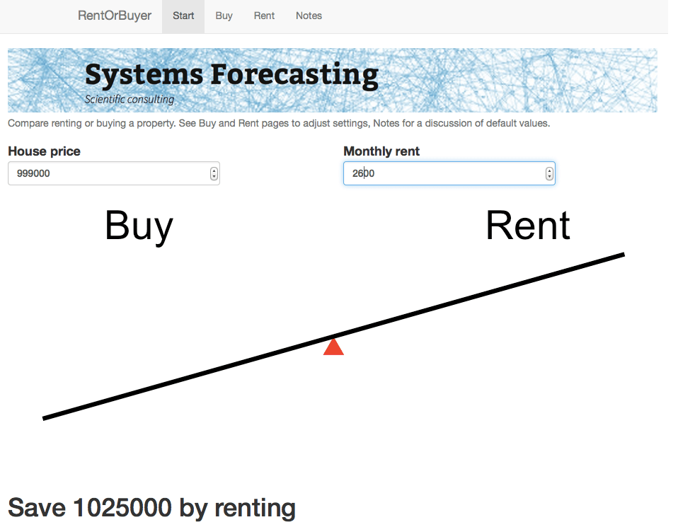
As an example, I was recently offered the opportunity to buy a house in the Toronto area before it went on the market. The price was $999,000, which is about average for Toronto. It was being rented out at $2600 per month. Was it a good deal?
Usually real estate decisions are based on two factors – what similar properties are selling for, and what the rate of appreciation appears to be. In this case I was told that the houses on the street were selling for about that amount, and furthermore were going up by about a $100K per year (the Toronto market is very hot right now). But both of these factors depend on what other people are doing and thinking about the market – and group dynamics are not always the best measure of value (think the Dutch tulip bulb crisis).
A potentially more useful piece of information is the current rent earned by the property. This gives a sense of how much the house is worth as a provider of housing services, rather than as a speculative investment, and therefore plays a similar role as the earnings of a company. And it offers a benchmark to which we can compare the price of the house.
Consider two different scenarios, Buy and Rent. In the Buy scenario, the costs include the initial downpayment, mortgage payments, and monthly maintenance fees (including regular repairs, utilities, property taxes, and accrued expenses for e.g. major renovations). Once the mortgage period is complete the person ends up with a fully-paid house.
For the Rent scenario, we assume identical initial and monthly outflows. However the housing costs in this case only involve rent and utilities. The initial downpayment is therefore invested, as are any monthly savings compared to the Buy scenario. The Rent scenario therefore has the same costs as the Buy scenario, but the person ends up with an investment portfolio instead of a house. By showing which of these is worth more, we can see whether in financial terms it is better to buy or rent.
This is the idea behind our latest web app: the RentOrBuyer. By supplying values for price, mortgage rates, expected investment returns, etc., the user can compare the total cost of buying or renting a property and decide whether that house is worth buying. (See also this Globe and Mail article, which also suggests useful estimates for things like maintenance costs.)
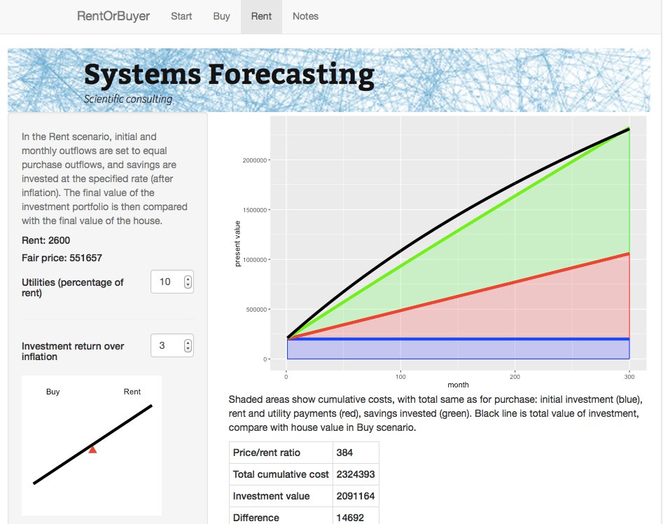
The RentOrBuyer app allows the user to compare the overall cumulative cost of buying or renting a home.
The Rent page gives details about the rent scenario including a plot of cumulative costs.
For the $999,000 house, and some perfectly reasonable assumptions for the parameters, I estimate savings by renting of about … a million dollars. Which is certainly enough to give one pause. Give it a try yourself before you buy that beat up shack!
Of course, there are many uncertainties involved in the calculation. Numbers like interest rates and returns on investment are liable to change. We also don’t take into account factors such as taxation, which may have an effect, depending on where you live. However, it is still possible to make reasonable assumptions. For example, an investment portfolio can be expected to earn more over a long time period than a house (a house might be nice, but it’s not going to be the next Apple). The stock market is prone to crashes, but then so is the property market as shown by the first figure. Mortgage rates are at historic lows and are likely to rise.
While the RentOrBuyer can only provide an estimate of the likely outcome, the answers it produces tend to be reasonably robust to changes in the assumptions, with a fair ratio of house price to rent typically working out in the region of 200-220. Perhaps unsurprisingly, this is not far off the historical average. Institutions such as the IMF and central banks use this ratio along with other metrics such as the ratio of average prices to earnings to detect housing bubbles. As an example, according to Moody’s Analytics, the average ratio for metro areas in the US was near its long-term average of about 180 in 2000, reached nearly 300 in 2006 with the housing bubble, and was back to 180 in 2010.
House prices in many urban areas – in Canada, Toronto and especially Vancouver come to mind – have seen a remarkable run-up in price in recent years (see my World Finance article). However this is probably due to a number of factors such as ultra-low interest rates following the financial crash, inflows of (possibly laundered) foreign cash, not to mention a general enthusiasm for housing which borders on mania. The RentOrBuyer app should help give some perspective, and a reminder that the purpose of a house is to provide a place to live, not a vehicle for gambling.
Housing in Crisis: When Will Metro Markets Recover? Mark Zandi, Celia Chen, Cristian deRitis, Andres Carbacho-Burgos, Moody’s Economy.com, February 2009.