In 11 easy lessons:
Notes:
QEF01 – Introduction to Quantum Economics and Finance
QEF02 – Quantum Probability and Logic
QEF03 – Basics of Quantum Computing
QEF07 – The Prisoner’s Dilemma
QEF09 – Threshold Effects in Quantum Economics

The Minsky model was developed by Steve Keen as a simple macroeconomic model that illustrates some of the insights of Hyman Minsky. The model takes as its starting point Goodwin’s growth cycle model (Goodwin, 1967), which can be expressed as differential equations in the employment rate and the wage share of output.
The equations for Goodwin’s model are determined by assuming simple linear relationships between the variables (see Keen’s paper for details). Changes in real wages are linked to the employment rate via the Phillips curve. Output is assumed to be a linear function of capital stock, investment is equal to profit, and the rate of change of capital stock equals investment minus depreciation.
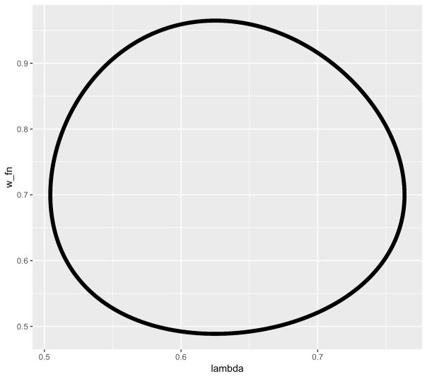
The equations in employment rate and wage share of output turn out to be none other than the Lotka–Volterra equations which are used in biology to model predator-prey interaction. As employment rises from a low level (like a rabbit population), wages begin to climb (foxes), until wages becomes too high, at which point employment declines, followed by wages, and so on in a repeating limit cycle.
In order to incorporate Minsky’s insights concerning the role of debt finance, a first step is to note that when profit’s share of output is high, firms will borrow to invest. Therefore the assumption that investment equals profit is replaced by a nonlinear function for investment. Similarly the linear Phillips curve is replaced by a more realistic nonlinear relation (in both cases, a generalised exponential curve is used). The equation for profit is modified to include interest payments on the debt. Finally the rate of change of debt is set equal to investment minus profit.
Together, these changes mean that the simple limit cycle behavior of the Goodwin model becomes much more complex, and capable of modelling the kind of nonlinear, debt-fueled behavior that (as Minsky showed) characterises the real economy. A separate equation also accounts for the adjustment of the price level, which converges to a markup over the monetary cost of production.
So how realistic is this model? The idea that employment level and wages are in a simple (linear or nonlinear) kind of predator-prey relation seems problematic, especially given that in recent decades real wages in many countries have hardly budged, regardless of employment level. Similarly the notion of a constant linear “accelerator” relating output to capital stock seems a little simplistic. Of course, as in systems biology, any systems dynamics model of the economy has to make such compromises, because otherwise the model becomes impossible to parameterise. As always, the model is best seen as a patch which captures some aspects of the underlying dynamics.
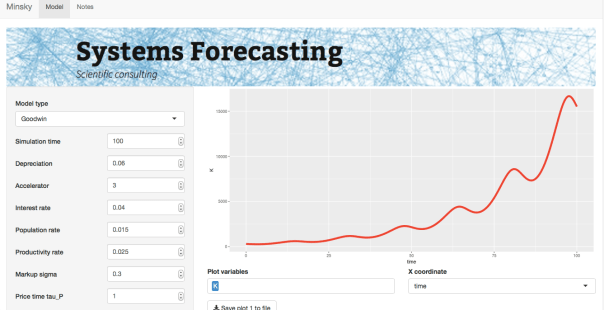
In order to experiment with the model, I coded it up as a Shiny app. The model has rate equations for the following variables: capital K, population N, productivity a, wage rate w, debt D, and price level P. (The model can also be run using Keen’s Minsky software.) Keen also has a version that includes an explicit monetary sector (see reference), which adds a few more equations and more complexity. At that point though I might be tempted to look at simpler models of particular subsets of the economy.
References
Goodwin, Richard, 1967. A growth cycle. In: Feinstein, C.H. (Ed.), Socialism, Capitalism and Economic Growth. Cambridge University Press, Cambridge, 54–58.
Keen, S. (2013). A monetary Minsky model of the Great Moderation and the Great Recession. Journal of Economic Behavior and Organization, 86, 221-235.

Cover article (in Japanese) by David Orrell in Newsweek Japan on why economists can’t predict the future. Read an extract here.

BUY ON AMAZON.COM BUY ON AMAZON.CO.UK
Explore the deadly elegance of finance’s hidden powerhouse
The Money Formula takes you inside the engine room of the global economy to explore the little-understood world of quantitative finance, and show how the future of our economy rests on the backs of this all-but-impenetrable industry. Written not from a post-crisis perspective – but from a preventative point of view – this book traces the development of financial derivatives from bonds to credit default swaps, and shows how mathematical formulas went beyond pricing to expand their use to the point where they dwarfed the real economy. You’ll learn how the deadly allure of their ice-cold beauty has misled generations of economists and investors, and how continued reliance on these formulas can either assist future economic development, or send the global economy into the financial equivalent of a cardiac arrest.
Rather than rehash tales of post-crisis fallout, this book focuses on preventing the next one. By exploring the heart of the shadow economy, you’ll be better prepared to ride the rough waves of finance into the turbulent future.
How do you create a quadrillion dollars out of nothing, blow it away and leave a hole so large that even years of “quantitative easing” can’t fill it – and then go back to doing the same thing? Even amidst global recovery, the financial system still has the potential to seize up at any moment. The Money Formula explores the how and why of financial disaster, what must happen to prevent the next one.

PRAISE FOR THE MONEY FORMULA
“This book has humor, attitude, clarity, science and common sense; it pulls no punches and takes no prisoners.”
Nassim Nicholas Taleb, Scholar and former trader
“There are lots of people who′d prefer you didn′t read this book: financial advisors, pension fund managers, regulators and more than a few politicians. That′s because it makes plain their complicity in a trillion dollar scam that nearly destroyed the global financial system. Insiders Wilmott and Orrell explain how it was done, how to stop it happening again and why those with the power to act are so reluctant to wield it.”
Robert Matthews, Author of Chancing It: The Laws of Chance and How They Can Work for You
“Few contemporary developments are more important and more terrifying than the increasing power of the financial system in the global economy. This book makes it clear that this system is operated either by people who don′t know what they are doing or who are so greed–stricken that they don′t care. Risk is at dangerous levels. Can this be fixed? It can and this book full of healthy skepticism and high expertise shows how.”
Bryan Appleyard, Author and Sunday Times writer
“In a financial world that relies more and more on models that fewer and fewer people understand, this is an essential, deeply insightful as well as entertaining read.”
Joris Luyendijk, Author of Swimming with Sharks: My Journey into the World of the Bankers
“A fresh and lively explanation of modern quantitative finance, its perils and what we might do to protect against a repeat of disasters like 2008–09. This insightful, important and original critique of the financial system is also fun to read.”
Edward O. Thorp, Author of A Man for All Markets and New York Times bestseller Beat the Dealer
In a previous blog entry, see here, we discussed how survival analysis methods could be used to determine the profitability of P2P loans. The “trick” highlighted in that previous post was to focus on the profit/loss of a loan – which in fact is what you actually care about – rather than when and if a loan defaults. In doing so we showed that even loans that default are profitable if interest rates are high enough and the period of loan short enough.
Given that basic survival analysis methods shed light on betting strategies that could be profitable, are there more aggressive approaches that exist in the healthcare community that the financial world could take advantage of? The answer to that question is yes and it lies in using crowdsourcing as we shall now discuss.
Over recent years there has been an increase in prediction competitions in the healthcare sector. One set of organisers have aptly named these competitions as DREAM challenges, follow this link to their website. Compared to other prediction competition websites such as Kaggle here, the winning algorithms are made publicly available through the website and also published.
A recurring theme of these competitions, that simply moves from one disease area to the next, is survival. The most recent of these involved predicting the survival of prostate cancer patients who were given a certain therapy, results were published here. Unfortunately the paper is behind a paywall but the algorithm is downloadable from the DREAM challenge website.
The winning algorithm was basically an ensemble of Cox proportional hazards regression models, we briefly explained what these are in our previous blog entry. Those of you reading this blog who have a technical background will be thinking that doesn’t sound like an overly complicated modelling approach. In fact it isn’t – what was sophisticated was how the winning entry partitioned the data for explorative analyses and model building. The strategy appeared to be more important than the development of a new method. This observation resonates with the last blog entry on Big data versus big theory.
So what does all this have to do with the financial sector? Well competitions like the one described above can quite easily be applied to financial problems, as we blogged about previously, where survival analyses are currently being applied for example to P2P loan profitability. So the healthcare prediction arena is in fact a great place to search for the latest approaches for financial betting strategies.
Peer to peer lending is an option people are increasingly turning to, both for obtaining loans and for investment. The principle idea is that investors can decide who they give loans to, based on information provided by the loaner, and the loaner can decide what interest rate they are willing to pay. This new lending environment can give investors higher returns than traditional savings accounts, and loaners better interest rates than those available from commercial lenders.
Given the open nature of peer to peer lending, information is becoming readily available on who loans are given to and what the outcome of that loan was in terms of profitability for the investor. Available information includes the loaner’s credit rating, loan amount, interest rate, annual income, amount received etc. The open-source nature of this data has clearly led to an increased interest in analysing and modelling the data to come up with strategies for the investor which maximises their return. In this blog entry we will look at developing a model of this kind using an approach routinely used in healthcare, survival analysis. We will provide motivation as to why this approach is useful and demonstrate how a simple strategy can lead to significant returns when applied to data from the Lending Club.
In healthcare survival analysis is routinely used to predict the probability of survival of a patient for a given length of time based on information about that patient e.g. what diseases they have, what treatment is given etc. It is routinely used within the healthcare sector to make decisions both at the patient level, for example what treatment to give, and at the institutional level (e.g. health care providers), for example what new healthcare policies will decrease death associated with lung cancer. In most survival analysis studies the data-sets usually contain a significant proportion of patients who have yet to experience the event of interest by the time the study has finished. These patients clearly do not have an event time and so are described as being right-censored. An analysis can be conducted without these patients but this is clearly ignoring vital information and can lead to misleading and biased inferences. This could have rather large consequences were the resultant model applied prospectively. A key part of all survival analysis tools that have been developed is therefore that they do not ignore patients who are right censored. So what does this have to do with peer to peer lending?
The data on the loans available through sites such as the Lending Club contain loans that are current and most modelling methods described in other blogs have simply ignored these loans when building models to maximise investor’s returns. These loans described as being current are the same as our patients in survival analysis who have yet to experience an event at the time the data was collected. Applying a survival analysis approach will allow us to keep people whose loans are described as being current in our model development and thus utilise all information available. How can we apply survival analysis methods to loan data though, as we are interested in maximising profit and not how quickly a loan is paid back?
We need to select relevant dependent and independent variables first before starting the analysis. The dependent variable in this case is whether a loan has finished (fully repaid, defaulted etc.) or not (current). The independent variable chosen here is the relative return (RR) on that loan, this is basically the amount repaid divided by the amount loaned. Therefore if a loan has a RR value less than 1 it is loss making and greater than 1 it is profit making. Clearly loans that have yet to have finished are quite likely to have an RR value less than 1 however they have not finished and so within the survival analysis approach this is accounted for by treating that loan as being right-censored. A plot showing the survival curve of the lending club data can be seen in the below figure.

The black line shows the fraction of loans as a function of RR. We’ve marked the break-even line in red. Crosses represent loans that are right censored. We can already see from this plot that there are approximately 17-18% loans that are loss making, to the left of the red line. The remaining loans to the right of the red line are profit making. How do we model this data?
Having established what the independent and dependent variables are, we can now perform a survival analysis exercise on the data. There are numerous modelling options in survival analysis. We have chosen one of the easiest options, Cox-regression/proportional hazards, to highlight the approach which may not be the optimal one. So now we have decided on the modelling approach we need to think about what covariates we will consider.
A previous blog entry at yhat.com already highlighted certain covariates that could be useful, all of which are actually quite intuitive. We found that one of the covariates FICO range high (essentially is a credit score) had an interesting relationship to RR, see below.

Each circle represents a loan. It’s strikingly obvious that once the last FICO Range High score exceeds ~ 700 the number of loss making loans, ones below the red line decreases quite dramatically. So a simple risk adverse strategy would be just to invest in loans whose FICO Range High score exceeds 700, however there are still profitable loans which have a FICO Range High value less than 700. In our survival analysis we can stratify for loans below and above this 700 FICO Range High score value.
We then performed a rather routine survival analysis. Using FICO Range High as a stratification marker we looked at a series of covariates previously identified in a univariate analysis. We ranked each of the covariates based on the concordance probability. The concordance probability gives us information on how good a covariate is at ranking loans, a value of 0.5 suggests that covariate is no better than tossing a coin whereas a value of 1 is perfect, which never happens! We are using concordance probability rather than p-values, which is often done, because the data-set is very large and so many covariates come out as being “statistically significant” even though they have little effect on the concordance probability. This is a classic problem of Big Data and one option, of many, is to focus model building on another metric to counter this issue. If we use a step-wise building approach and use a simple criterion that to include a covariate the concordance probability must increase by at least 0.01 units, then we end up with a rather simple model: interest rate + term of loan. This model gave a concordance probability value of 0.81 in FICO Range High >700 and 0.63 for a FICO Range High value <700. Therefore, it does a really good job once we have screened out the bad loans and not so great when we have a lot of bad loans but we have a strategy that removes those.
This final model is available online here and can be found on the web-apps section of the website. When playing with the model you will find that if interest rates are high and the term of loan is low then regardless of the FICO Range High value all loans are profitable, however those with FICO Range High values >700 provide a higher return, see figure below.

The above plot was created by using an interest rate of 20% for a 36 month loan. The plot shows two curves, the one in red represents a loan whose FICO Range High value <700 and the black one a loan with FICO Range High value >700. The curves describe your probability of attaining a certain amount of profit or loss. You can see that for the input values used here, the probability of making a loss is similar regardless of the FICO Range High Value; however the amount of return is better for loans with FICO Range High value >700.
Using survival analysis techniques we have shown that you can create a relatively simple model that lends itself well for interpretation, i.e. probability curves. Performance of the model could be improved using random survival forests – the gain may not be as large as you might expect but every percentage point counts. In a future blog we will provide an example of applying survival analysis to actual survival data.
Latest book The Evolution of Money with Roman Chlupatý is published this week by Columbia University Press. Everything you need to know about money (except how to make it!).

Suppose you were offered the choice between investing in one of two assets. The first, asset A, has a long term real price history (i.e. with inflation stripped out) which looks like this:
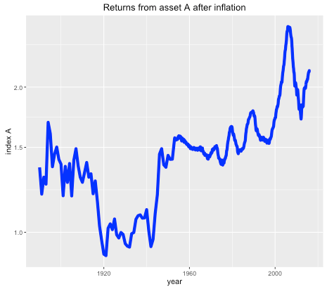
It seems that the real price of the asset hasn’t gone anywhere in the last 125 years, with an average compounded growth rate of about half a percent. The asset also appears to be needlessly volatile for such a poor performance.
Asset B is shown in the next plot by the red line, with asset A shown again for comparison (but with a different vertical scale):
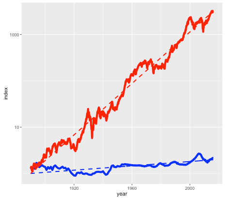
Note again this is a log scale, so asset B has increased in price by more than a factor of a thousand, after inflation, since 1890. The average compounded growth rate, after inflation, is 6.6 percent – an improvement of over 6 percent compared to asset A.
On the face of it, it would appear that asset B – the steeply climbing red line – would be the better bet. But suppose that everyone around you believed that asset A was the correct way to build wealth. Not only were people investing their life savings in asset A, but they were taking out highly leveraged positions in order to buy as much of it as possible. Parents were lending their offspring the money to make a down payment on a loan so that they wouldn’t be deprived. Other buyers (without rich parents) were borrowing the down payment from secondary lenders at high interest rates. Foreigners were using asset A as a safe store of wealth, one which seemed to be mysteriously exempt from anti-money laundering regulations. In fact, asset A had become so systemically important that a major fraction of the country’s economy was involved in either building it, selling it, or financing it.
You may have already guessed that the blue line is the US housing market (based on the Case-Shiller index), and the red line is the S&P 500 stock market index, with dividends reinvested. The housing index ignores factors such as the improvement in housing stock, so really measures the value of residential land. The stock market index (again based on Case-Shiller data) is what you might get from a hypothetical index fund. In either case, things like management and transaction fees have been ignored.
So why does everyone think housing is a better investment than the stock market?
Of course, the comparison isn’t quite fair. For one thing, you can live in a house – an important dividend in itself – while a stock market portfolio is just numbers in an account. But the vast discrepancy between the two means that we have to ask, is housing a good place to park your money, or is it better in financial terms to rent and invest your savings?
As an example, I was recently offered the opportunity to buy a house in the Toronto area before it went on the market. The price was $999,000, which is about average for Toronto. It was being rented out at $2600 per month. Was it a good deal?
Usually real estate decisions are based on two factors – what similar properties are selling for, and what the rate of appreciation appears to be. In this case I was told that the houses on the street were selling for about that amount, and furthermore were going up by about a $100K per year (the Toronto market is very hot right now). But both of these factors depend on what other people are doing and thinking about the market – and group dynamics are not always the best measure of value (think the Dutch tulip bulb crisis).
A potentially more useful piece of information is the current rent earned by the property. This gives a sense of how much the house is worth as a provider of housing services, rather than as a speculative investment, and therefore plays a similar role as the earnings of a company. And it offers a benchmark to which we can compare the price of the house.
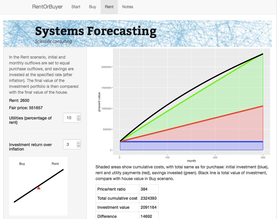
Consider two different scenarios, Buy and Rent. In the Buy scenario, the costs include the initial downpayment, mortgage payments, and monthly maintenance fees (including regular repairs, utilities, property taxes, and accrued expenses for e.g. major renovations). Once the mortgage period is complete the person ends up with a fully-paid house.
For the Rent scenario, we assume identical initial and monthly outflows. However the housing costs in this case only involve rent and utilities. The initial downpayment is therefore invested, as are any monthly savings compared to the Buy scenario. The Rent scenario therefore has the same costs as the Buy scenario, but the person ends up with an investment portfolio instead of a house. By showing which of these is worth more, we can see whether in financial terms it is better to buy or rent.
This is the idea behind our latest web app: the RentOrBuyer. By supplying values for price, mortgage rates, expected investment returns, etc., the user can compare the total cost of buying or renting a property and decide whether that house is worth buying. (See also this Globe and Mail article, which also suggests useful estimates for things like maintenance costs.)
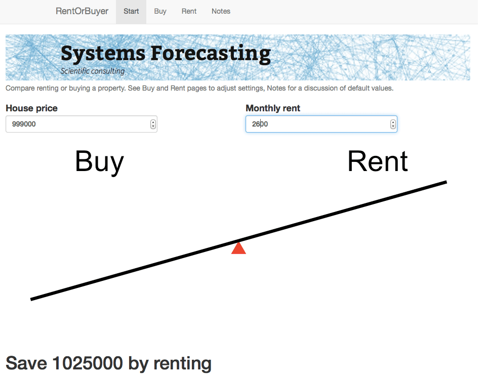
For the $999,000 house, and some perfectly reasonable assumptions for the parameters, I estimate savings by renting of about … a million dollars. Which is certainly enough to give one pause. Give it a try yourself before you buy that beat up shack!
Of course, there are many uncertainties involved in the calculation. Numbers like interest rates and returns on investment are liable to change. We also don’t take into account factors such as taxation, which may have an effect, depending on where you live. However, it is still possible to make reasonable assumptions. For example, an investment portfolio can be expected to earn more over a long time period than a house (a house might be nice, but it’s not going to be the next Apple). The stock market is prone to crashes, but then so is the property market as shown by the first figure. Mortgage rates are at historic lows and are likely to rise.
While the RentOrBuyer can only provide an estimate of the likely outcome, the answers it produces tend to be reasonably robust to changes in the assumptions, with a fair ratio of house price to rent typically working out in the region of 200-220. Perhaps unsurprisingly, this is not far off the historical average. Institutions such as the IMF and central banks use this ratio along with other metrics such as the ratio of average prices to earnings to detect housing bubbles. As an example, according to Moody’s Analytics, the average ratio for metro areas in the US was near its long-term average of about 180 in 2000, reached nearly 300 in 2006 with the housing bubble, and was back to 180 in 2010.
House prices in many urban areas – in Canada, Toronto and especially Vancouver come to mind – have seen a remarkable run-up in price in recent years (see my World Finance article). However this is probably due to a number of factors such as ultra-low interest rates following the financial crash, inflows of (possibly laundered) foreign cash, not to mention a general enthusiasm for housing which borders on mania. The RentOrBuyer app should help give some perspective, and a reminder that the purpose of a house is to provide a place to live, not a vehicle for gambling.
Try the RentOrBuyer app here.
Housing in Crisis: When Will Metro Markets Recover? Mark Zandi, Celia Chen, Cristian deRitis, Andres Carbacho-Burgos, Moody’s Economy.com, February 2009.