Category Archives: cancer models

“Personalising” radiotherapy dose using a short-term culture assay

The data-set we will be using for this post relates to the paper here. The article is from the group of Bruce Baguley who has written some fantastic papers on the cell-cycle times of cancer cells from patient samples over the years. (The data can be found here together with code relating to this post.)

In the data-set we have information on the culture cell cycle times for each patient’s sample, whether they had radiotherapy or not, and the patient’s survival times. (Note, this study was done long before numerous people had written about sample size calculations for multivariable survival analyses.) In total we have 70 patients all of whom had an event and the median survival was approximately 8 months. Of the 70 patients 37 had radiotherapy, 24 did not and for 9 we have no information. Just before we launch into the survival analysis and get overly excited, it’s worth noting the following…

There are numerous prognostic factors which have not been collected in this study, some are known now but weren’t known when this study was performed. This is an important point and should never be overlooked. Some of these known/unknown prognostic factors may well correlate with cell-cycle times and these may not need a tissue sample i.e. they could be really easy to measure. We shall come back to this point at the end of the post.

In the code provided you will see that we first build a survival model using radiotherapy as a covariate and find that there is a survival difference, those that have radiotherapy (black line in figure below) live longer than those that don’t (red line in figure below). (Let’s throw in a p-value to make certain readers happy, p<0.001.) So, we have a treatment effect.

We next assess whether in addition to the treatment effect cell-cycle times also correlate with survival. So, we add that to the model and lo and behold that improves our correlation to survival over a model with just radiotherapy, based on the likelihood ratio-test. What we really care about though is the interaction between treatment and cell-cycle times… hold your breath…there does seem to be an interaction (see code here) – everyone cheers with delight. (Note, you may want to use splines – the relationship between log(hazard) and biomarkers can be non-linear, it probably is; recall the Circulating Tumour Cell story here.)

A simple way of looking at an interaction could be to simply plot survival probabilities, at a certain time-point, as a function of the biomarker, with and without radiotherapy, see below (red is no radiotherapy and black is with radiotherapy). (In the code you will also find a calibration plot showing how well the model describes the data at 6 months.)

Two plots are displayed on purpose, the one on the left is the point estimate only and the one on the right includes the 95% confidence interval (dashed lines). What the plot shows is that the survival benefit of radiotherapy becomes less certain with increasing cell-cycle times. To some people this is what you would expect – the benefit of RT to be dependent on cell-cycle times. (If you do a search for radiotherapy and cell-cycle you will start to understand the reasons why.) How does seeing the confidence interval affect your interpretation? What if I also mention the cell-cycle times come with a low degree of precision. These uncertainties may play an even bigger role when thinking about personalising dose…

Although information on what the radiotherapy dose is not available it is likely that all the patients had the same dose. (It’s a single center study.) Therefore, the plot shown above we could argue is for a dose of 0 (black line) and another dose unspecified (red line), so we have two “points” on a dose-response curve.  That’s clearly not enough.  That is, we don’t really know what the benefit of radiotherapy is over no therapy at say either a lower or higher dose across the cell-cycle range without more data.

If we could generate more data what would be useful is a plot that shows the gain in survival, say at a fixed time-point of interest, for different doses and cell-cycle times and a corresponding plot for toxicities of interest. Such that as a patient I could see what the cost is to me – what am I prepared to endure and also how uncertain are these estimates. I wonder if we were to account for uncertainty the predicted dose would become a predicted dose-range and it may actually include the current standard dose for all patients mightn’t it? Finally, …

There are numerous technical issues too, can we get good samples, what are the patient characteristics for those we can’t compare to those we can? How easy is the assay to run – could I do it in the Outer Hebrides? Maybe we also want to consider certain confounders – what would be a big one for cell-cycle time? Maybe tumour volume? Hmmm…

Circulating “Tumour” Cells and Magic Numbers

“Three, that’s the Magic Number

Yes, it is, it’s the Magic Number…”

The above two lines are the opening lyrics of De La Souls hit song from the 1980s “The Magic Number”. The number three also happens to be an important number if you are counting Circulating Tumour Cells (CTC) using the Cell Search kit in metastatic colorectal cancer (mCRC). (See mCRC section, p18 onwards, in the marketing brochure here for more details and also a publication here.) That number directly relates to a patients’ survival prognosis: if a patient has 3 or more CTCs prior to treatment, then that patients’ prognosis will be poorer than for a patient with less than 3 CTCs.

You may be wondering, is the survival probability the same for someone who has 4 versus 100 CTCs? When the platform says 3 how accurate is it? Why did I put “Tumour” in quotation marks? In this blog-post we will briefly explore these questions.

Why the quotation marks around Tumour? Our first port of call will be the brochure (link) mentioned above. The first section of the brochure focusses on the Limitations, Expected Values and Performance Characteristics of the kit.  If you take a look at Figure 1 on pVII you will see the distribution of CTC counts across numerous metastatic tumour types, benign disease and healthy volunteers. 10 of the 295 health volunteer samples contained a single CTC. This doesn’t mean the healthy volunteers have cancer but simply highlights that the system may also pick up healthy epithelial cells. Therefore, it may be more appropriate to call these cells Circulating Epithelial Cells rather than Circulating Tumour Cells. Discussions I’ve had with scientists at conferences seem to agree with this, as it appears there is a mix of healthy and cancerous epithelial cells within a sample.

Next, how good is the system at sensing the number of tumour cells when you know approximately how many were in the sample to begin with? The answer to this question can be seen in Table 4 on pVII of the marketing brochure (link).  What the table highlights is that as you would expect the recovery is not 100% accurate, there is a modest difference between the expected number and the observed in the samples.

In summary there is a degree of noise in the enumeration process of CTCs. This noise may explain why when scientists have searched for thresholds, they have been quite low.  It may be that you need to see 3, 4 or 5 to be sure you actually have one genuine CTC in your sample. So, it could be the thresholds being used are simply related to whether or not there are CTCs there in the sample.

Moving on to the final question, is a patient’s risk of death the same if they have a small number of CTCs versus a large number.  In order to answer this, we need a data-set. A digitized data-set from a study in metastatic castrate resistant prostate cancer (mCRPC) will be used, the original study can be read about here and the data-set can be found here with some example code going through the analysis below. The cohort contains 156 patients, 94 deaths with a median survival time of 21 months (95% confidence interval was 16-24 months).

In mCRPC the Magic Number is 5. If patients have less than 5 their prognosis is better than those that have 5 or more.  So, the question we are interested in, is the prognosis of a patient with 5 CTCs different from someone who has 100 CTCs?

Below is a figure of the distribution of CTC counts in this cohort of patients. You will notice that there is a large proportion of patients with 0 or 1 values, 38/156 and 15/156 respectively.  There is generally quite a wide range of values.

The next plot we shall look at is one of survival probability over time of groups of patients generated by splitting the distribution of CTC counts into 8 groups (generated by looking at the 12.5th, 25th, 37.5th, 50th, 62.5th, 75th and 87.5th percentiles), see below.

The plot shows that as a patient’s CTC count increases their prognosis worsens. Imagine a patient with a CTC count of 5 (located in the dark blue group) versus a patient with CTC count 100 (located in the grey group). It’s clear the prognosis of these two groups is different.  Yet if we use the Magic Number 5 both patients will be told they have the same prognosis, which is clearly incorrect. Let’s explore this further and move away from categorising CTC counts…

An alternative way of visualizing the data can be obtained by plotting the log(Hazard Ratio) as a function of CTC counts according to the groups, see plot below.

We can see that the relationship is not quite linear nor does there appear to be an obvious cut-point. In fact, the relationship looks rather sigmoidal, like a Hill function (or to pharmacologists an Emax model). In fact we can fit a Hill function, Hmax/(1+(CTC50/CTC)^h), to the data as shown below.  (Hmax, CTC50 and h are parameters that need to be estimated.)

So how does this compare with using the Magic Number 5? In the code, see here, you will see a comparison of model likelihoods which highlights, unsurprisingly, that a sigmoid model better describes the data than using the magic number 5 as well as many other discrimination indexes.

This brief analysis clearly shows using a Magic Number approach to analysing the correlation between CTC counts and prognosis is clearly not in the patient’s favour.  Imagine if this was your data, let’s stop dichotomania!

Ignoring Uncertainty in Collaborative Conceptual Models

This blog-post relates to a meeting entitled “Modelling Challenges in Cancer and Immunology: one-day meeting of LMS MiLS”. The meeting was held at the beautiful location of Kings College London. The talks were a mix of mathematical modelling and experimental – with most combining the two disciplines together. The purpose of the meeting was to foster new collaborations between the people at the meeting.

Collaboration is a key aspect of this intersection between cancer and immunology since no one person can truly have a complete understanding of both fields, and nor can they possess all the skill-sets needed. When collaborating though each of us trusts the experts in their respective fields to bring conceptual models to the table for discussion. It’s very important to understand how these conceptual models have developed over time.

Every scientist has developed their knowledge via their own interpretation of the data/evidence over their careers. However, the uncertainty in the data/evidence used to make statements such as A interacts with B is rarely mentioned.

For many scientists, null hypothesis testing has been used to help them develop “knowledge” within a field. This “knowledge”, throughout that scientists’ career, has been typically gained by using a p-value threshold of 0.05 with very little consideration of the size of effect or what the test actually means.

For example, at the meeting mentioned there was a stream of statements, which were made to sound like facts, on correlations which were tenuous at best simply because the p-value was below 0.05. An example is the figure below, where the data has a correlation coefficient of 0.22 (“p<0.05”). The scientist from this point onwards will say A correlates with B consigning the noise/variability to history.

Could it be that the conceptual models we discuss are based on decades of analyses described as above? I would argue this is often the case and was certainly present at the meeting. This may argue for having very large collaboration groups and looking for consensus, however being precisely biased is in no-one’s best interests!

Perhaps the better alternative is to teach uncertainty concepts at a far earlier stage in a scientist’s career. That is introducing Bayesian statistics (see blog-post on Bayesian Opinionater) earlier rather than entraining scientists into null-hypothesis testing.  This would generally improve the scientific process – and will probably reduce my blood pressure when attending meetings like this one.


Is this the golden age for open patient level oncology data?

Over the last few years there has been a growth in databases that house individual patient data from clinical trials in Oncology.  In this blog post we will take a look at two of these databases, ProjectDataSphere and ClinicalStudyDataRequest, and discuss our own experiences of using them for research.

ProjectDataSphere houses the control arms of many phase III clinical trials. It has been used to run prediction competitions which we have discussed in a previous blog-post, see here. Gaining access to this database is rather straightforward.  A user simply fills in a form and within 24-48 hours access is granted. You can then download the data sets together with a data dictionary to help you decipher the variable codes and start your research project.  This all sounds too easy, so what’s the catch?

The main issue is being able to understand the coding of the variables, once you’ve deciphered what they mean it’s pretty straightforward to begin a project.  It does help if you have had experience working with such data-sets before. An example of a project that can be conducted with such data can be found here. In brief, the paper explores both a biased and un-biased correlation of tumour growth rate to survival, a topic we have blogged about before, see here.

If you want to access all arms of a clinical trial then ClinicalStudyDataRequest is for you. This is a very large database that spans many disease areas. However access to the data is not as straightforward as ProjectDataSphere.  A user must submit an analysis plan stating the research objectives, methods, relevant data-sets etc. Once the plan has been approved, which can take between 1-2 months from our experience, access is granted to the data-sets.  This access though is far more restrictive than ProjectDataSphere.  The user connects to a server where the data is stored and has to perform all analysis using the software provided, which is R with a limited number of libraries. Furthermore there is a time-restriction on how long you can have access to the data.  Therefore it really is a good idea to have every aspect of your analysis planned and ensure you have the time to complete it.

An example of a project we have undertaken using this database can be found here. In brief the paper describes how a model of tumour growth can be used to analyse the decay and growth rates of tumours under the action of three drugs that have a similar mechanism of action. A blog-post discussing the motivation behind the tumour growth model can be found here.

There are of course many databases other than the two discussed here with an oncology focus, e.g. SEER, TCGA, YODA etc. The growth in such databases clearly suggests that this may well be the golden age for patient level oncology data. Hopefully this growth in open data will also lead to a growth in knowledge.

Hierarchical oncology combination therapy: which level leads to success?

The traditional preclinical combination experiment in Oncology for two drugs A and B is as follows. A cancer cell-line is exposed to increasing concentrations of drug A alone, drug B alone and also various concentrations of the combination for a fixed amount of time. That is we determine what effect drug A and B have as monotherapies which subsequently helps us to understand what the combination effect is. There are many articles which describe how mathematical/computational models can be used to analyse such data and possibly predict the combination effect using information on monotherapy agents alone. Those models can be either based on mechanism at the pathway or phenotype level (see CellCycler for an example of the latter) or they could be machine learning approaches. We shall call combinations at this scale cellular as they are mainly focussed on analysing combination effects at that scale. What other scales are their?

We know that human cancers contain more than one type of cell-population so the next scale from the cellular level is the tissue level.  At this level we may have populations of cells with distinct genetic backgrounds either within one tumour or across multiple tumours within one patient. Here we may find for example that drug A kills cell type X and drug B doesn’t, but drug B kills cell-type Y and drug A doesn’t. So the combination can be viewed as a cell population enrichment strategy as it is still effective even though the two drugs do not interact in any way.

Traditional drug combination screening, as described above, are not designed to explore these types of combinations. There is another scale which is probably even less well known, the human population scale …

A typical human clinical combination trial in Oncology can involve combining new drug B with existing treatment A and comparing that to A only. It is unlikely that a 3rd arm in this trial looking at drug B alone is likely to occur.  The reason for this is that if an existing treatment is known to have an effect then it’s unethical to not use it. Unless one knows what effect the new drug B has on its own, it is difficult to assess what the effect of the combination is. Indeed the combination may simply enrich the patient population. That is, if drug A shrinks tumours in patient population X and drug B doesn’t, but drug B shrinks tumours in patient population Y and drug A doesn’t, then if the trial contains both X and Y there is still a  combination effect which is greater than drug A alone.

Many people reading this blog are probably aware that when we see positive combination affects in the clinic that it could be due to this type of patient enrichment. At a meeting in Boston in April of this year a presentation from Adam Palmer suggests that two thirds of marketed combinations in Oncology can be explained in this way, see second half (slide 27 onwards) of this presentation here. This includes current immunotherapy combinations.

We can now see why combinations in Oncology can be viewed as hierarchical. How appreciative the research community is of this is unknown.  Indeed one of the latest challenges from CRUK (Cancer Research UK), see here, suggests that even they may not be fully aware of it. That challenge merely focusses on the well-trodden path of the first level described here. Which level is the best to target? Is it easier to target the tissue and human population level than the cellular one? Only time will tell.

Cancer Reproducibility Project

At a recent meeting at a medical health faculty, researchers were asked to nominate their favourite papers. One person instead of nominating a paper nominated a whole project website, The Reproducibility Project in Cancer Biology, see here. This person was someone who had left the field of systems biology to re-train as a biostatistician.  In case you might be wondering it wasn’t me!  In this blog-post we will take a look at the project, the motivation behind it and some of the emerging results.

The original paper which sets out the aims of the project can be found here. The initiative was a joint collaboration between the Center of Open Science and Science Exchange. The motivation behind it is likely to be quite obvious to many readers, but for those who are unfamiliar it relates to the fact that there are many incentives given to exciting new results, much less for verifying old discoveries.

The main paper goes into some detail about the reasons why it is difficult to reproduce results. One of the key factors is openness, which is why this is the first reproducibility attempt that has extensive documentation. The project’s main reason for choosing cancer research was due to previous findings published by Bayer and Amgen, see here and here. In those previous reports the exact details regarding which replication studies were attempted were not published, hence the need for an open project.

The first part of a reproducibility project is to decide which articles to pick. The obvious choices are the ones that are cited the most and have had the most publicity.  Indeed this is what the project did.  They chose 50 of the most impactful articles in cancer biology published between 2010 and 2012. The experimental group used to conduct the replication studies was not actually a single group.  The project utilised the Science Exchange, see here, which is a network that consists of over 900 contract research organisations (CROs). Thus they did not have to worry about finding the people with the right skills.

One clear advantage of using a CRO over an academic lab is that there is no reason for them to be biased either for or against a particular experiment, which may not be true of academic labs. The other main advantage is time and cost – scale up is more efficient. All the details of the experiments and power calculations of the original studies were placed on the Open Science Framework, see here.  So how successful has the project been?

The first sets of results are out and as expected they are variable.  If you would like to read the results in detail, go to this link here.  The five projects were:

  • BET bromodomain inhibition as a therapeutic strategy to target c-Myc.
  • The CD47-signal regulatory protein alpha (SIRPa) interaction is a therapeutic target for human solid tumours.
  • Melanoma genome sequencing reveals frequent PREX2 mutations.
  • Discovery and preclinical validation of drug indications using compendia of public gene expression data.
  • Co-administration of a tumour-penetrating peptide enhances the efficacy of cancer drugs.

Two of the studies (1) and (4) were largely successful ,  and one (5) was not. The other two replication studies were found to be un-interpretable as the animal cancer models showed odd behaviour: they either grew too fast or exhibited spontaneous tumour regressions!

One of the studies which was deemed un-interpretable has led to a clinical trial: development of an anti-CD47 antibody. These early results highlight that there is an issue around reproducing preclinical oncology experiments, but many already knew this. (Just to add, this is not about reproducing p-values but size and direction of effects.)  The big question is how to improve the reproducibility of research; there are many opinions on this matter.  Clearly one step is to reward replication studies, which is easier said than done in an environment where novel findings are the ones that lead to riches!

Misapplication of statistical tests to simulated data: Mathematical Oncologists join Cardiac Modellers

In a previous blog post we highlighted the pitfalls of applying null hypothesis testing to simulated data, see here.  We showed that modellers applying null hypothesis testing to simulated data can control the p-value because they can control the sample size. Thus it’s not a great idea to analyse simulations using null hypothesis tests, instead modellers should focus on the size of the effect.  This problem has been highlighted before by White et al.  which is well worth a read, see here.

Why are we blogging about this subject again? Since that last post, co-authors of the original article we discussed there have repeated the same misdemeanour (Liberos et al., 2016), and a group of mathematical oncologists based at Moffitt Cancer Center has joined them (Kim et al., 2016).

The article by Kim et al., preprint available here, describes a combined experimental and modelling approach that “predicts” new dosing schedules for combination therapies that can delay onset of resistance and thus increase patient survival.  They also show how their approach can be used to identify key stratification factors that can determine which patients are likely to do better than others. All of the results in the paper are based on applying statistical tests to simulated data.

The first part of the approach taken by Kim et al. involves calibrating a mathematical model to certain in-vitro experiments.  These experiments basically measure the number of cells over a fixed observation time under 4 different conditions: control (no drug), AKT inhibitor, Chemotherapy and Combination (AKT/Chemotherapy).  This was done for two different cell lines. The authors found a range of parameter values when trying to fit their model to the data. From this range they took forward a particular set, no real justification as to why that certain set, to test the model’s ability to predict different in-vitro dosing schedules. Unsurprisingly the model predictions came true.

After “validating” their model against a set of in-vitro experiments the authors proceed to using the model to analyse retrospective clinical data; a study involving 24 patients.  The authors acknowledge that the in-vitro system is clearly not the same as a human system.  So to account for this difference they perform an optimisation method to generate a humanised model.  The optimisation is based on a genetic algorithm which searched the parameter space to find parameter sets that replicate the clinical results observed.  Again, similar to the in-vitro situation, they found that there were multiple parameter sets that were able to replicate the observed clinical results. In fact they found a total of 3391 parameter sets.

Having now generated a distribution of parameters that describe patients within the clinical study they are interested in, the authors next set about generating stratification factors. For each parameter set the virtual patient exhibits one of four possible response categories. Therefore for each category a distribution of parameter values exists for the entire population. To assess the difference in the distribution of parameter values across the categories they perform a students t-test to ascertain whether the differences are statistically significant. Since they can control the sample size the authors can control the standard error and p-value, this is exactly the issue raised by White et al. An alternative approach would be to state the difference in the size of the effect, so the difference in means of the distributions. If the claim is that a given parameter can discriminate between two types of responses then a ROC AUC (Receiver Operating Characteristic Area Under Curve) value could be reported. Indeed a ROC AUC value would allow readers to ascertain the strength of a given parameter in discriminating between two response types.

The application of hypothesis testing to simulated data continues throughout the rest of the paper, culminating in applying a log-rank test to simulated survival data, where again they control the sample size. Furthermore, the authors choose an arbitrary cancer cell number which dictates when a patient dies. Therefore they have two ways of controlling the p-value.  In this final act the authors again abuse the use of null hypothesis testing to show that the schedule found by their modelling approach is better than that used in the actual clinical study.  Since the major results in the paper have all involved this type of manipulation, we believe they should be treated with extreme caution until better verified.

References

Liberos, A., Bueno-Orovio, A., Rodrigo, M., Ravens, U., Hernandez-Romero, I., Fernandez-Aviles, F., Guillem, M.S., Rodriguez, B., Climent, A.M., 2016. Balance between sodium and calcium currents underlying chronic atrial fibrillation termination: An in silico intersubject variability study. Heart Rhythm 0. doi:10.1016/j.hrthm.2016.08.028

White, J.W., Rassweiler, A., Samhouri, J.F., Stier, A.C., White, C., 2014. Ecologists should not use statistical significance tests to interpret simulation model results. Oikos 123, 385–388. doi:10.1111/j.1600-0706.2013.01073.x

Kim, E., Rebecca, V.W., Smalley, K.S.M., Anderson, A.R.A., 2016. Phase i trials in melanoma: A framework to translate preclinical findings to the clinic. Eur. J. Cancer 67, 213–222. doi:10.1016/j.ejca.2016.07.024


Time-dependent bias of tumour growth rate and time to tumour re-growth

The title of this blog entry refers to a letter published in the journal entitled, CPT: Pharmacometrics & Systems Pharmacology. The letter is open-access so those of you interested can read it online here.  In this blog entry we will go through it.

The letter discusses a rather strange modelling practice which is becoming the norm within certain modelling and simulation groups in the pharmaceutical industry. There has been a spate of publications citing that tumour re-growth rate (GR) and time to tumour re-growth (TTG), derived using models to describe imaging time-series data, correlates to survival [1-6]. In those publications the authors show survival curves (Kaplan-Meiers) highlighting a very strong relationship between GR/ TTG and survival.  They either split on the median value of GR/TTG or into quartiles and show very impressive differences in survival times between the groups created; see Figure 2 in [4] for an example (open access).

Do these relationships seem too good to be true? In fact they may well be. In order to derive GR/TTG you need time-series data. The value of these covariates are not known at the beginning of the study, and only become available after a certain amount of time has passed.  Therefore this type of covariate is typically referred to as a time-dependent covariate. None of the authors in [1-6] describe GR/TTG as a time-dependent covariate nor treat it as such.

When the correlations to survival were performed in those articles the authors assumed that they knew GR/TTG before any time-series data was collected, which is clearly not true. Therefore survival curves, such as Figure 2 in [4], are biased as they are based on survival times calculated from study start time to time of death, rather than time from when GR/TTG becomes available to time of death.  Therefore, the results in [1-6] should be questioned and GR/TTG should not be used for decision making, as the question around whether tumour growth rate correlates to survival is still rather open.

Could it be the case that the GR/TTG correlation to survival is just an illusion of a flawed modelling practice?  This is what we shall answer in a future blog-post.

[1] W.D. Stein et al., Other Paradigms: Growth Rate Constants and Tumor Burden Determined Using Computed Tomography Data Correlate Strongly With the Overall Survival of Patients With Renal Cell Carcinoma, Cancer J (2009)

[2] W.D. Stein, J.L. Gulley, J. Schlom, R.A. Madan, W. Dahut, W.D. Figg, Y. Ning, P.M. Arlen, D. Price, S.E. Bates, T. Fojo, Tumor Regression and Growth Rates Determined in Five Intramural NCI Prostate Cancer Trials: The Growth Rate Constant as an Indicator of Therapeutic Efficacy, Clin. Cancer Res. (2011)

[3] W.D. Stein et al., Tumor Growth Rates Derived from Data for Patients in a Clinical Trial Correlate Strongly with Patient Survival: A Novel Strategy for Evaluation of Clinical Trial Data, The Oncologist.  (2008)

[4] K. Han, L. Claret, Y. Piao, P. Hegde, A. Joshi, J. Powell, J. Jin, R. Bruno, Simulations to Predict Clinical Trial Outcome of Bevacizumab Plus Chemotherapy vs. Chemotherapy Alone in Patients With First-Line Gastric Cancer and Elevated Plasma VEGF-A, CPT Pharmacomet. Syst. Pharmacol. (2016)

[5] J. van Hasselt et al., Disease Progression/Clinical Outcome Model for Castration-Resistant Prostate Cancer in Patients Treated With Eribulin, CPT Pharmacomet. Syst. Pharmacol. (2015)

[6] L. Claret et al., Evaluation of Tumor-Size Response Metrics to Predict Overall Survival in Western and Chinese Patients With First-Line Metastatic Colorectal Cancer, J. Clin. Oncol. (2013)

The exponential growth effect

A common critique of biologists, and scientists in general, concerns their occasionally overenthusiastic tendency to find patterns in nature – especially when the pattern is a straight line. It is certainly notable how, confronted with a cloud of noisy data, scientists often manage to draw a straight line through it and announce that the result is “statistically significant”.

Straight lines have many pleasing properties, both in architecture and in science. If a time series follows a straight line, for example, it is pretty easy to forecast how it should evolve in the near future – just assume that the line continues (note: doesn’t always work).

However this fondness for straightness doesn’t always hold; indeed there are cases where scientists prefer to opt for a more complicated solution. An example is the modelling of tumour growth in cancer biology.

Tumour growth is caused by the proliferation of dividing cells. For example if cells have a cell cycle length td, then the total number of cells will double every td hours, which according to theory should result in exponential growth. In the 1950s (see Collins et al., 1956) it was therefore decided that the growth rate could be measured using the cell doubling time.

In practice, however, it is found that tumours grow more slowly as time goes on, so this exponential curve needed to be modified. One variant is the Gompertz curve, which was originally derived as a model for human lifespans by the British actuary Benjamin Gompertz in 1825, but was adapted for modelling tumour growth in the 1960s (Laird, 1964). This curve gives a tapered growth rate, at the expense of extra parameters, and has remained highly popular as a means of modelling a variety of tumour types.

However, it has often been observed empirically that tumour diameters, as opposed to volumes, appear to grow in a roughly linear fashion. Indeed, this has been known since at least the 1930s. As Mayneord wrote in 1932: “The rather surprising fact emerges that the increase in long diameter of the implanted tumour follows a linear law.” Furthermore, he noted, there was “a simple explanation of the approximate linearity in terms of the structure of the sarcoma. On cutting open the tumour it is often apparent that not the whole of the mass is in a state of active growth, but only a thin capsule (sometimes not more than 1 cm thick) enclosing the necrotic centre of the tumour.”

Because only this outer layer contains dividing cells, the rate of increase for the volume depends on the doubling time multiplied by the volume of the outer layer. If the thickness of the growing layer is small compared to the total tumour radius, then it is easily seen that the radius grows at a constant rate which is equal to the doubling time multiplied by the thickness of the growing layer. The result is a linear growth in radius. This  translates to cubic growth in volume, which of course grows more slowly than an exponential curve at longer times – just as the data suggests.

In other words, rather than use a modified exponential curve to fit volume growth, it may be better to use a linear equation to model diameter. This idea that tumour growth is driven by an outer layer of proliferating cells, surrounding a quiescent or necrotic core, has been featured in a number of mathematical models (see e.g. Checkley et al., 2015, and our own CellCycler model).  The linear growth law can also be used to analyse tumour data, as in the draft paper: “Analysing within and between patient patient tumour heterogenity via imaging: Vemurafenib, Dabrafenib and Trametinib.” The linear growth equation will of course not be a perfect fit for the growth of all tumours (no simple model is), but it is based on a consistent and empirically verified model of tumour growth, and can be easily parameterised and fit to data.

So why hasn’t this linear growth law caught on more widely? The reason is that what scientists see in data often depends on their mental model of what is going on.

I first encountered this phenomenon in the late 1990s when doing my D.Phil. in the prediction of nonlinear systems, with applications to weather forecasting. The dominant theory at the time said that forecast error was due to sensitivity to initial condition, aka the butterfly effect. As I described in The Future of Everything, researchers insisted that forecast errors showed the exponential growth characteristic of chaos, even though plots showed they clearly grew with slightly negative curvature, which was characteristic of model error.

A similar effect in cancer biology has again changed the way scientists interpret data. Sometimes, a straight line really is the best solution.

References

Collins, V. P., Loeffler, R. K. & Tivey, H. Observations on growth rates of human tumors. The American journal of roentgenology, radium therapy, and nuclear medicine 76, 988-1000 (1956).

Laird A. K. Dynamics of tumor growth. Br J of Cancer 18 (3): 490–502 (1964).

W. V. Mayneord. On a Law of Growth of Jensen’s Rat Sarcoma. Am J Cancer 16, 841-846 (1932).

Stephen Checkley, Linda MacCallum, James Yates, Paul Jasper, Haobin Luo, John Tolsma, Claus Bendtsen. Bridging the gap between in vitro and in vivo: Dose and schedule predictions for the ATR inhibitor AZD6738. Scientific Reports, 5(3)13545 (2015).

Yorke, E. D., Fuks, Z., Norton, L., Whitmore, W. & Ling, C. C. Modeling the Development of Metastases from Primary and Locally Recurrent Tumors: Comparison with a Clinical Data Base for Prostatic Cancer. Cancer Research 53, 2987-2993 (1993).

Hitesh Mistry, David Orrell, and Raluca Eftimie. Analysing within and between patient patient tumour heterogenity via imaging: Vemurafenib, Dabrafenib and Trametinib. (Working paper)

The CellCycler

Tumour modelling has been an active field of research for some decades, and a number of approaches have been taken, ranging from simple models of an idealised spherical tumour, to highly complex models which attempt to account for everything from cellular chemistry to mechanical stresses. Some models use ordinary differential equations, while others use an agent-based approach to track individual cells.

A disadvantage of the more complex models is that they involve a large number of parameters, which can only be roughly estimated from available data. If the aim is to predict, rather than to describe, then this leads to the problem of overfitting: the model is very flexible and can be tuned to fit available data, but is less useful for predicting for example the effect of a new drug.

Indeed, there is a rarely acknowledged tension in mathematical modelling between realism, in the sense of including lots of apparently relevant features, and predictive accuracy. When it comes to the latter, simple models often out-perform complex models. Yet in most areas there is a strong tendency for researchers to develop increasingly intricate models. The reason appears to have less to do with science, than with institutional effects. As one survey of business models notes (and these points would apply equally to cancer modelling) complex models are preferred in large part because: “(1) researchers are rewarded for publishing in highly ranked journals, which favor complexity; (2) forecasters can use complex methods to provide forecasts that support decision-makers’ plans; and (3) forecasters’ clients may be reassured by incomprehensibility.”

Being immune to all such pressures (this is just a blog post after all!) we decided to develop the CellCycler – a parsimonius “toy” model of a cancer tumour that attempts to capture the basic growth and drug-response dynamics using only a minimal number of parameters and assumptions.  The model uses circa 100 ordinary differential equations (ODEs) to simulate cells as they pass through the phases of the cell cycle; however the equations are simple and the model only uses parameters that can be observed or reasonably well approximated. It is available online as a Shiny app.

CellCyclerScreenshot1
Screenshot of the Cells page of the CellCycler. The plot shows how a cell population is affected by two different drugs.

The CellCycler model divides the cell cycle into a number of discrete compartments, and is therefore similar in spirit to other models that for example treat each phase G1, S, G2, and mitosis as a separate compartment, with damaged cells being shunted to their own compartment (see for example the model by Checkley et al. here). Each compartment has its own set of ordinary differential equations which govern how its volume changes with time due to growth, apoptosis, or damage from drugs. There are additional compartments for damaged cells, which may be repaired or lost to apoptosis. Drugs are simulated using standard PK models, along with a simple description of phase-dependent drug action on cells. For the tumour growth, we use a linear model, based like the Checkley et al. paper on the assumption of a thin growing layer (see also our post on The exponential growth effect).

The advantages of compartmentalising

Dividing the cell cycle into separate compartments has an interesting and useful side effect, which is that it introduces a degree of uncertainty into the calculation. For example, if a drug causes damage and delays progress in a particular phase, then that drug will tend to synchronize the cell population in that state. However there is an obvious difference between cells that are affected when they are at the start of the phase, and those that are already near the end of the phase. If the compartments are too large, that precise information about the state of cells is lost.

The only way to restore precision would be to use a very large number of compartments. But in reality, individual cells will not all have exactly the same doubling time. We therefore want to have a degree of uncertainty. And this can be controlled by adjusting the number of compartments.

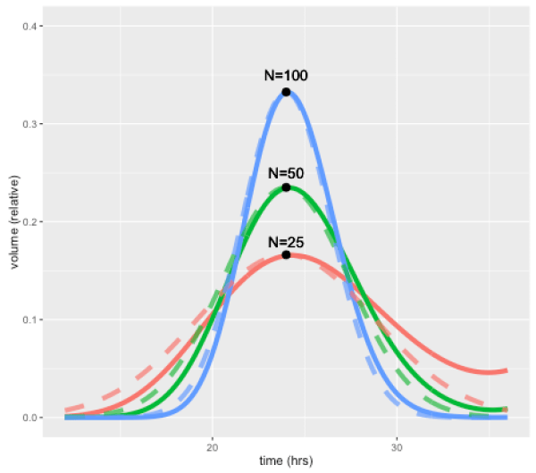
This effect is illustrated by the figure below, which shows how a perturbation at time zero in one compartment tends to blur out over time, for models with 25, 50, and 100 compartments, and a doubling time of 24 hours. In each case a perturbation is made to compartment 1 at the beginning of the cell cycle (the magnitude is scaled to the number of compartments so the total size of the perturbation is the same in terms of total volume). For the case with 50 compartments, the curve after one 24 hours is closely approximated by a normal distribution with standard deviation of 3.4 hours or about 14 percent. In general, the standard deviation can be shown to be approximately equal to the doubling time divided by the square root of N.

PertSimulationPlot
The solid lines show volume in compartment 1 following a perturbation to that compartment alone, after one cell doubling period of 24 hours. The cases shown are with N=25, 50, and 100 compartments. Dashed lines are the corresponding normal distributions.

A unique feature of the CellCycler is that it exploits this property as a way of adjusting the variability of doubling time in the cell population. The model can therefore provide a first-order approximation to the more complex heterogeneity that can be simulated using agent-based models. While we don’t usually have exact data on the spread of doubling times in the growing layer, the default level of 50 compartments gives what appears to be a reasonable degree of spread (about 14 percent). Using 25 compartments gives 20 percent, while using 100 compartments decreases this to 10 percent.

Using the CellCycler

The starting point for the Shiny web application is the Cells page, which is used to model the dynamics of a growing cell population. The key parameters are the average cell doubling time, and the fraction spent in each phase. The number of model compartments can be adjusted in the Advanced page: note that, along with doubling time spread, the choice also affects both the simulation time (more compartments is slower), and the discretisation of the cell cycle. For example with 50 compartments the proportional phase times will be rounded off to the nearest 1/50=0.02.

The next pages, PK1 and PK2, are used to parameterise the PK models and drug effects. The program has a choice of standard PK models, with adjustable parameters such as Dose/Volume.  In addition the phase of action (choices are G1, S, G2, M, or all), and rates for death, damage, and repair can be adjusted. Finally, the Tumor page (shown below) uses the model simulation to generate a plot of tumor radius, given an initial radius and growing layer. Plots can be overlaid with experimental data.

CellCyclerScreenshot2
Screenshot of the Tumor page, showing tumor volume (black line) compared to control (grey). Cell death due to apoptosis by either drug (red and blue) and damage (green) are also shown.

We hope the CellCycler can be a useful tool for research or for exploring the dynamics of tumour growth. As mentioned above it is only a “toy” model of a tumour. However, all our models of complex organic systems – be they of a tumor, the economy, or the global climate system – are toys compared to the real things. And of course there is nothing to stop users from extending the model to incorporate additional effects. Though whether this will lead to improved predictive accuracy is another question.

Try the CellCycler web app here.

References:

Stephen Checkley, Linda MacCallum, James Yates, Paul Jasper, Haobin Luo, John Tolsma, Claus Bendtsen. “Bridging the gap between in vitro and in vivo: Dose and schedule predictions for the ATR inhibitor AZD6738,” Scientific Reports.2015;5(3)13545.

Green, Kesten C. & Armstrong, J. Scott, 2015. “Simple versus complex forecasting: The evidence,” Journal of Business Research, Elsevier, vol. 68(8), pages 1678-1685.