In previous blog-posts we have discussed how simple models can perform just as well if not better than more complex ones when attempting to predict the cardiac liability of a new drug, see here and for the latest article on the matter here. One of the examples we discussed involved taking a signal, action-potential, deriving 100s of features from it and placing them into a machine learning algorithm to predict drug toxicity. This approach gave very impressive performance. However, we found that we could get the same results by simply adding/subtracting 3 numbers together! It seems there are other examples of this nature…
A recent paper sent to me was on the topic of recidivism, see here. The paper explored how well a machine learning algorithm which uses >100 features performed compared to the general public at predicting re-offending risk. What they found is that the general public was just as good. They also found that the performance of the machine learning algorithm could be easily matched by a two variable model!
Let’s move back to the life-sciences and take a look at an emerging field called radiomics. This field is in its infancy compared to the two already discussed above. In simple terms radiomics involves extracting information from an image of a tumour. Now the obvious parameter to extract is the size of the tumour through measuring its volume, a parameter termed Gross Tumour Volume, see here for a more detailed description. In addition to this though, like in the cardiac story, you can derive many more parameters, from the imaging signal. Again similar to the cardiac story you can apply machine learning techniques on the large data-set created to predict events of interest such as patient survival.
The obvious question to ask is: what do you gain over using the original parameter that is derived, Gross Tumour Volume? Well it appears the answer is very little, see supplementary table 1 from this article here for a first example. Within the table the authors calculate the concordance index for each model. (A concordance index value of 0.5 is random chance whereas a value of 1 implies perfect association, the closer to 1 the better.) The table includes p-values as well as the concordance index, let’s ignore the p-values and focus on the size of effect. What the table shows is that tumour volume is as good as the radiomics model in 2 out of the 3 data-sets, Lung2 and H&N1, and in the 3rd, H&N2, TNM is as good as radiomics:
TNM
(Tumour Staging)
Volume
Radiomics
TNM + Radiomics
Volume + Radiomics
Lung2
0.60
0.63
0.65
0.64
0.65
H&N1
0.69
0.68
0.69
0.70
0.69
H&N2
0.66
0.65
0.69
0.69
0.68
They then went on and combined the radiomics model with the other two but did not compare what happens when you combine TNM and tumour volume, a 2 variable model, to all other options. The question we should ask is why didn’t they? Also is there more evidence on this topic?
A more recent paper, see here, from within the field assessed the difference in prognostic capabilities between radiomics, genomics and the “clinical model”. This time tumour volume was not explored, why wasn’t it? Especially given that it looked so promising in the earlier study. The “clinical model” in this case consisted of two variables, TNM and histology, given we collect so much more than this, is this really a fair representation of a “clinical model”? The key result here was that radiomics only made a difference once you also included a genomic model too over the “clinical model” see Figure 5 in the paper. Even then the size of improvement was very small. I wonder what the performance of a simple model that involved TNM and tumour volume would have looked like, don’t you?
Radiomics meet Recidivism-Omics and Action-Potential-Omics you have more in common with them than you realise i.e. simplicity may beat complexity yet again!
The title of this blog-post refers to a meeting which I attended recently which was sponsored by the UK QSP network. Some of you may not be familiar with the term QSP, put it simply it describes the application of mathematical and computational tools to pharmacology. As the title of the blog-post suggests the meeting was on the subject of model reduction.
The meeting was split into 4 sessions entitled:
How to test if your model is too big?
Model reduction techniques
What are the benefits of building a non-identifiable model?
Techniques for over-parameterised models
I was asked to present a talk in the first session, see here for the slide-set. The talk was based on a topic that has been mentioned on this blog a few times before, ion-channel cardiac toxicity prediction. The latest talk goes through how 3 models were assessed in their ability to discriminate between non-cardio-toxic and cardio-toxic drugs across 3 data-sets which are currently available. (A report providing more details is currently being put together and will be released shortly.) The 3 models used were a linear combination of block (simple model – blog-post here) and 2 large scale biophysical models of a cardiac cell, one termed the “gold-standard” (endorsed by FDA and other regulatory agencies/CiPA – [1])and the other forming a key component of the “cardiac safety simulator” [2].
The results showed that the simple model does just as well and in certain data-sets out-performs the leading biophysical models of the heart, see slide 25. Towards the end of the talk I discussed what drivers exist for producing such large models and should we invest further in them given the current evidence, see slides 24, 28 and 33. How does this example fit into all the sessions of the meeting?
In answer to the first session title: How to test if your model is too big? The answer is straightforward: if the simpler/smaller model outperforms the larger model then the larger model is too big. Regarding the second session on model reduction techniques – in this case there is no need for these. You could argue, from the results discussed here, that instead of pursuing model reduction techniques we may want to consider building smaller/simpler models to begin with. Onto the 3rd session, on the benefits of building a non-identifiable model, it’s clear that there was no benefit in this situation in developing a non-identifiable model. Finally regarding techniques for over-parameterised models – the lesson learned from the cardiac toxicity field is just don’t build these sorts of models for this question.
Some people at the meeting argued that the type of model depends on the question, this is true, but does the scale of the model depend on the question?
If we now go back to the title of the meeting, is there a case for model reduction? Within the field of ion-channel cardiac toxicity the response would be: Why bother reducing a large model when you can build a smaller and simpler model which shows equal/better performance?
Of course, within the (skeptical) framework of Green and Armstrong [3] point out (see slide 28), one reason for model reduction is that for researchers it is the best of both worlds: they can build a highly complex model, suitable for publication in a highly-cited journal, and then spend more time extracting a simpler version to support client plans. Maybe those journals should look more closely at their selection criteria.
References
[1] Colatsky et al. The Comprehensive in Vitro Proarrhythmia Assay (CiPA) initiative — Update on progress. Journal of Pharmacological and Toxicological Methods. (2016) Volume 81 pages 15-20.
[2] Glinka A. and Polak S. QTc modification after risperidone administration – insight into the mechanism of action with use of the modeling and simulation at the population level approach. Toxicol. Mech. Methods (2015) 25 (4) pages 279-286.
[3] Green K. C. and Armstrong J. S. Simple versus complex forecasting: The evidence. Journal Business Research. (2015) 68 (8) pages 1678-1685.
The Winter 2017 edition of Foresight magazine includes my commentary on the article Changing the Paradigm for Business Forecasting by Michael Gilliland from SAS. Both are behind a paywall (though a longer version of Michael’s argument can be read on his SAS blog), but here is a brief summary.
According to Gilliland, business forecasting is currently dominated by an “offensive” paradigm, which is “characterized by a focus on models, methods, and organizational processes that seek to extract every last fraction of accuracy from our forecasts. More is thought to be better—more data, bigger computers, more complex models—and more elaborate collaborative processes.”
He argues that our “love affair with complexity” can lead to extra effort and cost, while actually reducing forecast accuracy. And while managers have often been seduced by the idea that “big data was going to solve all our forecasting problems”, research shows that even with complex models, forecast accuracy often fails to beat even a no-change forecasting model. His article therefore advocates a paradigm shift towards “defensive” forecasting, which focuses on simplifying the forecasting process, eliminating bad practices, and adding value.
My comment on this (in about 1200 words) is … I agree. But I would argue that the problem is less big data, or even complexity, than big theory.
Our current modelling paradigm is fundamentally reductionist – the idea is to reduce a system to its parts, figure out the laws that govern their interactions, build a giant simulation of the whole thing, and solve. The resulting models are highly complex, and their flexibility makes them good at fitting past data, but they tend to be unstable (or stable in the wrong way) and are poor at making predictions.
If however we recognise that complex systems have emergent properties that resist a reductionist approach, it makes more sense to build models that only attempt to capture some aspect of the system behaviour, instead of reproducing the whole thing.
An example of this approach, discussed earlier on this blog, relates to the question of predicting heart toxicity for new drug compounds, based on ion channel readings. One way to predict heart toxicity based on these test results is to employ teams of researchers to build an incredibly complicated mechanistic model of the heart, consisting of hundreds of differential equations, and use the ion channel inputs as inputs. Or you can use a machine learning model. Or, most complicated, you can combine these in a multi-model approach. However Hitesh Mistry found that a simple model, which simply adds or subtracts the ion channel readings – the only parameters are +1 and -1 – performs just as well as the multi-model approach using three large-scale models plus a machine learning model (see Complexity v Simplicity, the winner is?).
Now, to obtain the simple model Mistry used some fairly sophisticated data analysis tools. But what counts is not the complexity of the methods, but the complexity of the final model. And in general, complexity-based models are often simpler than their reductionist counterparts.
I therefore strongly agree with Michael Gilliland that a “defensive” approach makes sense. But I think the paradigm shift he describes is part of, or related to, a move away from reductionist models, which we are realising don’t work very well for complex systems. With this new paradigm, models will be simpler, but they can also draw on a range of techniques that have developed for the analysis of complex systems.
A lot has changed in Seattle in the last 15 years. The area around South Lake Union, near where I lived, has been turned into a major hub for biotechnology and the life sciences. Amazon is constructing a new campus featuring giant ‘biospheres’ which look like nothing I have ever seen.
Attending the conference, though, was like a blast from the past – because unlike the models used by architects to design their space-age buildings, the models used in pharmacology have barely moved on.
While there were many interesting and informative presentations and posters, most of these involved relatively simple models based on ordinary differential equations, very similar to the ones we were developing at the ISB years ago. The emphasis at the conference was on using models to graphically present relationships, such as the interaction between drugs when used in combination, and compute optimal doses. There was very little about more modern techniques such as machine learning or data analysis.
There was also little interest in producing models that are truly predictive. Many models were said to be predictive, but this just meant that they could reproduce some kind of known behaviour once the parameters were tweaked. A session on model complexity did not discuss the fact, for example, that complex models are often less predictive than simple models (a recurrent theme in this blog, see for example Complexity v Simplicity, the winner is?). Problems such as overfitting were also not discussed. The focus seemed to be on models that are descriptive of a system, rather than on forecasting techniques.
The reason for this appears to come down to institutional effects. For example, models that look familiar are more acceptable. Also, not everyone has the skills or incentives to question claims of predictability or accuracy, and there is a general acceptance that complex models are the way forward. This was shown by a presentation from an FDA regulator, which concentrated on models being seen as gold-standard rather than accurate (see our post on model misuse in cardiac models).
Pharmacometrics is clearly a very conservative area. However this conservatism means only that change is delayed, not that it won’t happen; and when it does happen it will probably be quick. The area of personalized medicine, for example, will only work if models can actually make reliable predictions.
As with Seattle, the skyline may change dramatically in a very short time.
A common critique of biologists, and scientists in general, concerns their occasionally overenthusiastic tendency to find patterns in nature – especially when the pattern is a straight line. It is certainly notable how, confronted with a cloud of noisy data, scientists often manage to draw a straight line through it and announce that the result is “statistically significant”.
Straight lines have many pleasing properties, both in architecture and in science. If a time series follows a straight line, for example, it is pretty easy to forecast how it should evolve in the near future – just assume that the line continues (note: doesn’t always work).
However this fondness for straightness doesn’t always hold; indeed there are cases where scientists prefer to opt for a more complicated solution. An example is the modelling of tumour growth in cancer biology.
Tumour growth is caused by the proliferation of dividing cells. For example if cells have a cell cycle length td, then the total number of cells will double every td hours, which according to theory should result in exponential growth. In the 1950s (see Collins et al., 1956) it was therefore decided that the growth rate could be measured using the cell doubling time.
In practice, however, it is found that tumours grow more slowly as time goes on, so this exponential curve needed to be modified. One variant is the Gompertz curve, which was originally derived as a model for human lifespans by the British actuary Benjamin Gompertz in 1825, but was adapted for modelling tumour growth in the 1960s (Laird, 1964). This curve gives a tapered growth rate, at the expense of extra parameters, and has remained highly popular as a means of modelling a variety of tumour types.
However, it has often been observed empirically that tumour diameters, as opposed to volumes, appear to grow in a roughly linear fashion. Indeed, this has been known since at least the 1930s. As Mayneord wrote in 1932: “The rather surprising fact emerges that the increase in long diameter of the implanted tumour follows a linear law.” Furthermore, he noted, there was “a simple explanation of the approximate linearity in terms of the structure of the sarcoma. On cutting open the tumour it is often apparent that not the whole of the mass is in a state of active growth, but only a thin capsule (sometimes not more than 1 cm thick) enclosing the necrotic centre of the tumour.”
Because only this outer layer contains dividing cells, the rate of increase for the volume depends on the doubling time multiplied by the volume of the outer layer. If the thickness of the growing layer is small compared to the total tumour radius, then it is easily seen that the radius grows at a constant rate which is equal to the doubling time multiplied by the thickness of the growing layer. The result is a linear growth in radius. This translates to cubic growth in volume, which of course grows more slowly than an exponential curve at longer times – just as the data suggests.
In other words, rather than use a modified exponential curve to fit volume growth, it may be better to use a linear equation to model diameter. This idea that tumour growth is driven by an outer layer of proliferating cells, surrounding a quiescent or necrotic core, has been featured in a number of mathematical models (see e.g. Checkley et al., 2015, and our own CellCycler model). The linear growth law can also be used to analyse tumour data, as in the draft paper: “Analysing within and between patient patient tumour heterogenity via imaging: Vemurafenib, Dabrafenib and Trametinib.” The linear growth equation will of course not be a perfect fit for the growth of all tumours (no simple model is), but it is based on a consistent and empirically verified model of tumour growth, and can be easily parameterised and fit to data.
So why hasn’t this linear growth law caught on more widely? The reason is that what scientists see in data often depends on their mental model of what is going on.
I first encountered this phenomenon in the late 1990s when doing my D.Phil. in the prediction of nonlinear systems, with applications to weather forecasting. The dominant theory at the time said that forecast error was due to sensitivity to initial condition, aka the butterfly effect. As I described in The Future of Everything, researchers insisted that forecast errors showed the exponential growth characteristic of chaos, even though plots showed they clearly grew with slightly negative curvature, which was characteristic of model error.
A similar effect in cancer biology has again changed the way scientists interpret data. Sometimes, a straight line really is the best solution.
References
Collins, V. P., Loeffler, R. K. & Tivey, H. Observations on growth rates of human tumors. The American journal of roentgenology, radium therapy, and nuclear medicine 76, 988-1000 (1956).
Laird A. K. Dynamics of tumor growth. Br J of Cancer 18 (3): 490–502 (1964).
W. V. Mayneord. On a Law of Growth of Jensen’s Rat Sarcoma. Am J Cancer 16, 841-846 (1932).
Stephen Checkley, Linda MacCallum, James Yates, Paul Jasper, Haobin Luo, John Tolsma, Claus Bendtsen. Bridging the gap between in vitro and in vivo: Dose and schedule predictions for the ATR inhibitor AZD6738. Scientific Reports, 5(3)13545 (2015).
Yorke, E. D., Fuks, Z., Norton, L., Whitmore, W. & Ling, C. C. Modeling the Development of Metastases from Primary and Locally Recurrent Tumors: Comparison with a Clinical Data Base for Prostatic Cancer. Cancer Research53, 2987-2993 (1993).
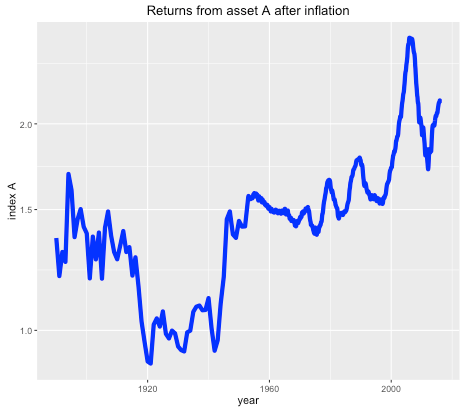
Suppose you were offered the choice between investing in one of two assets. The first, asset A, has a long term real price history (i.e. with inflation stripped out) which looks like this:
Long term historical return of asset A, after inflation, log scale.
It seems that the real price of the asset hasn’t gone anywhere in the last 125 years, with an average compounded growth rate of about half a percent. The asset also appears to be needlessly volatile for such a poor performance.
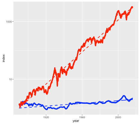
Asset B is shown in the next plot by the red line, with asset A shown again for comparison (but with a different vertical scale):
Long term historical return of assets A (blue line) and B (red line), after inflation, log scale.
Note again this is a log scale, so asset B has increased in price by more than a factor of a thousand, after inflation, since 1890. The average compounded growth rate, after inflation, is 6.6 percent – an improvement of over 6 percent compared to asset A.
On the face of it, it would appear that asset B – the steeply climbing red line – would be the better bet. But suppose that everyone around you believed that asset A was the correct way to build wealth. Not only were people investing their life savings in asset A, but they were taking out highly leveraged positions in order to buy as much of it as possible. Parents were lending their offspring the money to make a down payment on a loan so that they wouldn’t be deprived. Other buyers (without rich parents) were borrowing the down payment from secondary lenders at high interest rates. Foreigners were using asset A as a safe store of wealth, one which seemed to be mysteriously exempt from anti-money laundering regulations. In fact, asset A had become so systemically important that a major fraction of the country’s economy was involved in either building it, selling it, or financing it.
You may have already guessed that the blue line is the US housing market (based on the Case-Shiller index), and the red line is the S&P 500 stock market index, with dividends reinvested. The housing index ignores factors such as the improvement in housing stock, so really measures the value of residential land. The stock market index (again based on Case-Shiller data) is what you might get from a hypothetical index fund. In either case, things like management and transaction fees have been ignored.
So why does everyone think housing is a better investment than the stock market?
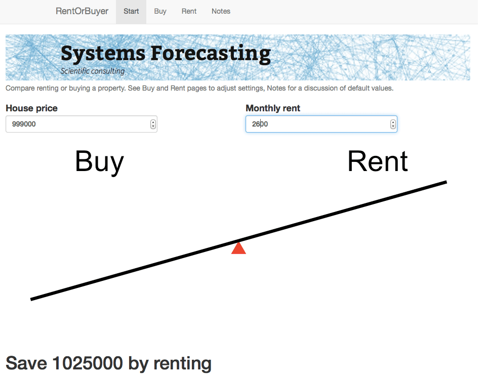
The RentOrBuyer
Of course, the comparison isn’t quite fair. For one thing, you can live in a house – an important dividend in itself – while a stock market portfolio is just numbers in an account. But the vast discrepancy between the two means that we have to ask, is housing a good place to park your money, or is it better in financial terms to rent and invest your savings?
As an example, I was recently offered the opportunity to buy a house in the Toronto area before it went on the market. The price was $999,000, which is about average for Toronto. It was being rented out at $2600 per month. Was it a good deal?
Usually real estate decisions are based on two factors – what similar properties are selling for, and what the rate of appreciation appears to be. In this case I was told that the houses on the street were selling for about that amount, and furthermore were going up by about a $100K per year (the Toronto market is very hot right now). But both of these factors depend on what other people are doing and thinking about the market – and group dynamics are not always the best measure of value (think the Dutch tulip bulb crisis).
A potentially more useful piece of information is the current rent earned by the property. This gives a sense of how much the house is worth as a provider of housing services, rather than as a speculative investment, and therefore plays a similar role as the earnings of a company. And it offers a benchmark to which we can compare the price of the house.
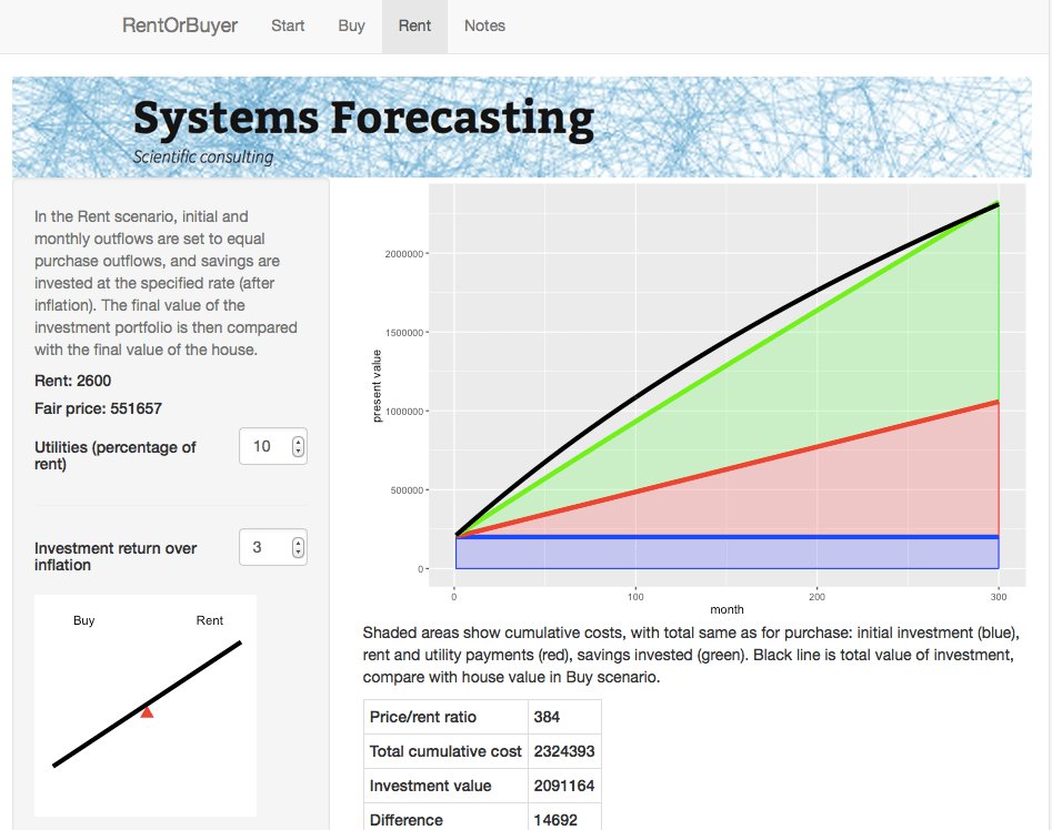
Consider two different scenarios, Buy and Rent. In the Buy scenario, the costs include the initial downpayment, mortgage payments, and monthly maintenance fees (including regular repairs, utilities, property taxes, and accrued expenses for e.g. major renovations). Once the mortgage period is complete the person ends up with a fully-paid house.
For the Rent scenario, we assume identical initial and monthly outflows. However the housing costs in this case only involve rent and utilities. The initial downpayment is therefore invested, as are any monthly savings compared to the Buy scenario. The Rent scenario therefore has the same costs as the Buy scenario, but the person ends up with an investment portfolio instead of a house. By showing which of these is worth more, we can see whether in financial terms it is better to buy or rent.
This is the idea behind our latest web app: the RentOrBuyer. By supplying values for price, mortgage rates, expected investment returns, etc., the user can compare the total cost of buying or renting a property and decide whether that house is worth buying. (See also this Globe and Mail article, which also suggests useful estimates for things like maintenance costs.)
The RentOrBuyer app allows the user to compare the overall cumulative cost of buying or renting a home.
The Rent page gives details about the rent scenario including a plot of cumulative costs.
For the $999,000 house, and some perfectly reasonable assumptions for the parameters, I estimate savings by renting of about … a million dollars. Which is certainly enough to give one pause. Give it a try yourself before you buy that beat up shack!
Of course, there are many uncertainties involved in the calculation. Numbers like interest rates and returns on investment are liable to change. We also don’t take into account factors such as taxation, which may have an effect, depending on where you live. However, it is still possible to make reasonable assumptions. For example, an investment portfolio can be expected to earn more over a long time period than a house (a house might be nice, but it’s not going to be the next Apple). The stock market is prone to crashes, but then so is the property market as shown by the first figure. Mortgage rates are at historic lows and are likely to rise.
While the RentOrBuyer can only provide an estimate of the likely outcome, the answers it produces tend to be reasonably robust to changes in the assumptions, with a fair ratio of house price to rent typically working out in the region of 200-220. Perhaps unsurprisingly, this is not far off the historical average. Institutions such as the IMF and central banks use this ratio along with other metrics such as the ratio of average prices to earnings to detect housing bubbles. As an example, according to Moody’s Analytics, the average ratio for metro areas in the US was near its long-term average of about 180 in 2000, reached nearly 300 in 2006 with the housing bubble, and was back to 180 in 2010.
House prices in many urban areas – in Canada, Toronto and especially Vancouver come to mind – have seen a remarkable run-up in price in recent years (see my World Finance article). However this is probably due to a number of factors such as ultra-low interest rates following the financial crash, inflows of (possibly laundered) foreign cash, not to mention a general enthusiasm for housing which borders on mania. The RentOrBuyer app should help give some perspective, and a reminder that the purpose of a house is to provide a place to live, not a vehicle for gambling.
Housing in Crisis: When Will Metro Markets Recover? Mark Zandi, Celia Chen, Cristian deRitis, Andres Carbacho-Burgos, Moody’s Economy.com, February 2009.
This is a question that comes up frequently in forecasting. But it is surprisingly hard to answer, because it boils down to predicting how accurate a forecast will be – a prediction about a prediction. Prediction squared.
One approach is to base the estimate on past errors in similar situations. This method is used for example by the National Institute of Statistics and Economic Studies (INSEE) in France, who wrote that “the distribution of forecasting errors calculated from past exercises is a reliable indicator of the distribution of future errors and hence of the uncertainty surrounding a given forecast” (see this research paper).
But this assumes that the new data will follow a familiar pattern – which may not be the case if for example you are trying to predict the effect of a novel economic policy, or a new drug, or climate change.
Another approach is to randomly perturb model parameters. But this has problems of its own.
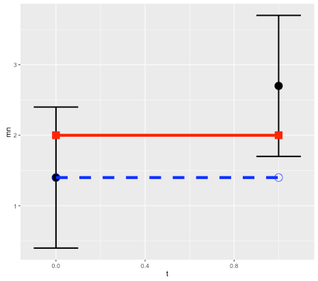
To illustrate this, consider a simple linear model x(t) = k*t + x0, and suppose we want to predict the state at time t=1 based on an observation at t=0. Without loss of generality we can set the expected slope of the model to k=0, so the prediction is a persistence forecast: x1 = x0 (here x1 = x(1) and x0 = x(0)). Treating errors as random variables, then (in terms of variance) the error in the prediction, relative to the observation, will be the sum of the variance of the initial and final observational errors (see note below for details).
Schematic for error in persistence model prediction. Black points are initial and final observations, with error bounds. Red line is true state (assumed to remain constant). Blue dashed line is prediction based on persistence model. Because the model is correct, all error is due to observations.
This makes sense since we are assuming the model is perfect, so all error comes from the observations. But in the real world, model error is not usually zero! Observational error is only part of the puzzle. So how do we estimate the contribution of model error?
As mentioned above, a typical approach is to perturb the parameters of the model by some reasonable amount, or do a Monte Carlo over a range of parameter values. (See paper on ensemble forecasting with model error.) For our simple linear model, a Monte Carlo simulation using a normal distribution around 0 with variance w for the parameter k would then give an ensemble of model predictions, with the same variance of w. Again this error will add to the error due to the observations.
This all sounds very logical and scientific, and versions of this approach are used by everyone from central bankers to weather forecasters. But again there is a catch, because the answer will depend on the parameter range that we selected. In other words, we can get whatever answer we want by choosing the range.
Of course, one can argue for a particular range – but if we are forecasting a new situation, we can’t base the estimate reliably on past data.
And there is an even more intractable issue – which is that the prediction error may be due not to parameter error, but to model structure. What if the actual system is not linear? (It probably isn’t.)
The ultimate problem is that the frequentist approach to statistics breaks down completely in forecasting – it relies on analyzing data, but the whole point of forecasting is that there is no data to measure (otherwise you could just measure it and not bother with the forecast).
Fortunately there is a solution, or at least an intellectually consistent method, which is to take a Bayesian approach. Unlike the commonly-taught frequentist approach, which treats probabilities as a measure of the frequency of observed events, the Bayesian approach interprets probabilities as a measure of degrees of belief. And in forecasting, confidence intervals ultimately are a measure of one’s confidence in the model.
In the case of our simple model, the idea is to come up with an initial confidence interval, based for example on previous experience, but see it as an estimate only, and refine it as more data comes in.
Of course this requires admitting that the confidence interval relies on subjective estimates. However doing so can help to avoid another problem in mathematical modelling, which is the tendency of frequentist error estimates to ignore the effect of context and prior information. Read our article on the BayesianOpinionator.
Notes:
For the simple linear model case, prediction error is the sum of the initial and final errors. We’ll use x to denote predictions, y for the true state, z for observations, and e for observational errors.
Suppose that the observed initial condition z0 is observed with an error e0, and the observed final point z1 has an error e1. So the true initial condition is y0 = z0 + e0, and the true final state is y1 = z1+ e1.
If we assume there is no model error, then y1 = y0. It follows that the difference between the forecast x1 = z0 and the observed final state z1 is:
error = z1- z0 = y1 – e1 – y0 + e0 = e0 – e1.
If the errors are assumed to be normal with variance v0 and v1, then the forecast error has variance v0 + v1 (variance is additive), which allows us to determine confidence intervals. So for example a 95% confidence interval would be +/-1.96 times the standard deviation.
If we assume that model error contributes an error at time 1 with variance w1, then again the variances are additive, and the total will increase to v0 + v1 + w1.
Yaron Hollander from the consultancy firm CT Think! published an interesting report on the use and abuse of models in transport forecasting. The report, which was summarised in Local Transport Today magazine, cited ten different problems, which apply not just to transport forecasting but to other areas of modelling as well:
1. Referring to model outputs when discussing impacts that weren’t modelled
2. Presenting modellers’ assumptions as if they were forecasts
3. “Blurring the caveats” provided by modellers when copying model outputs from a technical report to a summary report
4. Using model outputs at a level of geographical detail that does not match the capabilities of the model or the data that were used to develop it
5. Reporting estimated outcomes and benefits with a high level of precision, without sufficient commentary on the level of accuracy
6. Presenting a large number of model runs or scenarios with limited interpretation of each run, as if this gives a good understanding of the impacts of the investment
7.Avoiding clear statements about how unsure we really are about the future pace of social and economic trends
8. Testing the sensitivity of the results to some inputs as if it helps us understand the sensitivity to all inputs
9. Discussing uncertainty in forecasts as if all it could do is change the scale of the impacts, ignoring possible impacts of a very different nature
10. Avoiding discussions about the history of the model itself, which sometimes goes many years back and includes features that the current owners do not understand
I was invited along with several other people to give a response, which is included below. Although I didn’t mention computational biology as one of the areas affected, it certainly isn’t immune!
Here is the full response, which was published in LTT (paywall):
Forget complexity, models should be simple
The report by Yaron Hollander accurately identifies a number of different types of “model abuse” in transport forecasting. I would just add a couple of comments. One is that these problems are not unique to transport, but are common in many other areas of forecasting as well, as I found while researching my 2007 book The Future of Everything: The Science of Prediction. This is especially the case when the incentives of the forecasters are entwined with the outcome of the predictions.
An example from the early 1980s was a paper by Will Keepin and Brian Wynne which showed that a model used by nuclear scientists to predict future energy requirements vastly overestimated the need for nuclear power plants, as well as the number of nuclear scientists needed to design them. In finance, many of the models used to value complex derivatives are less about accuracy, than about justifying risky trades. This is why two leading quants, Paul Wilmott and Emanuel Derman, wrote their own Modelers’ Hippocratic Oath. Even apparently objective areas such as weather forecasting are not immune from model abuse. I would argue that techniques such as ensemble forecasting, which involves running many forecasts from perturbed initial conditions, are an example of Hollander’s point 8: “Testing the sensitivity of the results to some inputs as if it helps us understand the sensitivity to all inputs.”
The author notes that public consultation is a promising solution, however one of the attractive features of mathematical models, if defending them is the aim, is exactly the fact that they can only be understood by a relatively small number of experts (who often come from the same area). Mathematical equations can seem imposing to those outside the field, which grants a degree of immunity from external scrutiny. So the public needs access to experts who are willing to point out the flaws in models.
Mathematical modellers are always happy to build complex models of any system and attempt to make predictions. But we need more studies which attempt to answer a different forecasting question: based on past experience, and knowledge of a model’s strengths and weaknesses, are predictions based on the model likely to be accurate? The answer in many cases is “probably not” – which has implications for decision-makers. This does not of course mean that we should do away with modelling, only that we should concentrate on simple models, where the assumptions and parameters are well-understood, and be realistic about the uncertainty involved.