nlmixr and RStudio on Amazon Web Services (AWS)

Running large population PK/PD analyses on laptops and desktops often requires long computational times. This is quite tedious. In addition, when using parallel computing on your machine, it can slow it down for a while, creating further nuisances.

Outsourcing computation to the cloud is a solution to this problem. Among the various cloud providers, Amazon Web Service (AWS) is one of the most famous and used by industries in various fields. AWS elastic compute cloud (EC2) is a service that allows the user to easily create his/her own “machines”, called instances, with a certain hardware and software configuration. It is interesting to note that it is possible to scale up and down those instances whenever the user wants, by choosing the most suitable hardware configuration for a given analysis. Broadly speaking, the user can change the type of CPU, the number of cores (up to 192!) and the amount of RAM according to the need. It is possible to see the vast choice of configurations offered by AWS EC2 here. The pay-per-use pricing model is really interesting, see this link to get an idea.

AWS services are already exploited in pharmacometrics. In 2015, an interesting paper published in CPT:PSP explained how to configure NONMEM on AWS (https://doi.org/10.1002/psp4.12016). 

At Systems Forecasting we commonly use R, RStudio and the open source package nlmixr to perform PKPD and other data analyses. In order to speed up our own analyses we recently explored how to set-up nlmixr on AWS EC2. In this presentation by Lorenzo Chiudinelli, Nicola Melillo and Hitesh Mistry we explain, step by step, how to configure R, RStudio and nlmixr on AWS EC2. Feel free to check it out and provide feedback.

https://github.com/SystemsForecasting/nlmixr_on_AWS/blob/main/nlmixr_AWS.pdf

Patient selection bias of evolutionary based adaptive scheduling in cancer – benefit to public health?

In this blog-post we shall discuss an interesting approach to cancer treatment but also pose the question as to who is likely to benefit from such an approach.  Let’s first begin with the idea…

What is evolutionary based adaptive dosing/scheduling? The idea revolves around the concept that we have two or more types of cancer cells competing with each other, but only one population is sensitive to the treatment we give. (It must be noted that clinically competition hasn’t actually been observed, we will discuss this in a later blog-post.)  This drug sensitive population is in excess of the drug resistant cells and “out-competes” the resistant cells. The idea is you apply the drug to kill sensitive cells but then remove the drug once you see a certain drop in tumour burden.  This allows the sensitive cells to grow back and suppress the resistant cells. You then re-apply the drug and then stop again and continue to cycle. Note, that we are not changing the dose but simply deciding when to start-stop the dose. Let’s take a step back and discuss what the dose cycling represents before moving onto the main question in the title of this post…

Consider for example a hypothetical drug that has just been approved for a new indication and its schedule is continuous daily dosing. That’s the schedule but what about the dose? There are two choices: you could either use the maximum tolerated dose, or a dose based on exposure-response relationships if one is found. Now the latter does happen more than people realise, especially when there is an interest in combining drugs, in which case using the maximum tolerated dose may not be appropriate nor needed.

The adaptive therapy community has somewhat confused the choice of dose with the choice of schedule, this was apparent at their inaugural meeting CATMO 2020 (http://catmo2020.org/). As highlighted above their interest has been in the choice of schedule not choice of dose, they still use the maximum tolerated dose or the dose based on exposure-response relationships depending on the drug.  The maximum tolerated dose may well be different for a continuous schedule versus an adaptive schedule, that is the patient may be able to tolerate an even higher dose when there are dosing holidays introduced than when they are not. Let’s now move away from this long aside and get back to the main question…

What is the selection bias mentioned in the title? Well, in order to apply adaptive scheduling, you first need patients who actually respond to treatment, in fact you will want to ensure they have a reasonable depth of response i.e. reasonable number of drug sensitive cells. The response rate for most Oncology drugs is around 20-30%, this can increase in certain areas but let us consider this value as the “average”. It is only these patients, who respond to the original schedule, for whom adaptive scheduling can be applied. Patients who respond will have better prognosis (live longer) than those that don’t. Therefore, adaptive scheduling is only applicable to patients who gain the most benefit from the existing schedule. What about the patients who don’t have a strong depth of response and therefore have poor prognosis?  Should research funds and research time be spent on those that do best on treatment or those that don’t benefit at all?  What is better for public health: helping those that need it most, i.e. those that don’t respond to treatment, or those that need it least, i.e. those that do respond to treatment?

Teach yourself quantum economics!

In 11 easy lessons:

Notes:

QEF01 – Introduction to Quantum Economics and Finance

QEF02 – Quantum Probability and Logic

QEF03 – Basics of Quantum Computing

QEF04 – Quantum Cognition

QEF05 – The Quantum Walk

QEF06 – The Penny Flip Game

QEF07 – The Prisoner’s Dilemma

QEF08 – Quantizing Propensity

QEF09 – Threshold Effects in Quantum Economics

QEF10 – A Quantum Option Pricing Model

QEF11 – The Money Bomb

“Personalising” radiotherapy dose using a short-term culture assay

The data-set we will be using for this post relates to the paper here. The article is from the group of Bruce Baguley who has written some fantastic papers on the cell-cycle times of cancer cells from patient samples over the years. (The data can be found here together with code relating to this post.)

In the data-set we have information on the culture cell cycle times for each patient’s sample, whether they had radiotherapy or not, and the patient’s survival times. (Note, this study was done long before numerous people had written about sample size calculations for multivariable survival analyses.) In total we have 70 patients all of whom had an event and the median survival was approximately 8 months. Of the 70 patients 37 had radiotherapy, 24 did not and for 9 we have no information. Just before we launch into the survival analysis and get overly excited, it’s worth noting the following…

There are numerous prognostic factors which have not been collected in this study, some are known now but weren’t known when this study was performed. This is an important point and should never be overlooked. Some of these known/unknown prognostic factors may well correlate with cell-cycle times and these may not need a tissue sample i.e. they could be really easy to measure. We shall come back to this point at the end of the post.

In the code provided you will see that we first build a survival model using radiotherapy as a covariate and find that there is a survival difference, those that have radiotherapy (black line in figure below) live longer than those that don’t (red line in figure below). (Let’s throw in a p-value to make certain readers happy, p<0.001.) So, we have a treatment effect.

We next assess whether in addition to the treatment effect cell-cycle times also correlate with survival. So, we add that to the model and lo and behold that improves our correlation to survival over a model with just radiotherapy, based on the likelihood ratio-test. What we really care about though is the interaction between treatment and cell-cycle times… hold your breath…there does seem to be an interaction (see code here) – everyone cheers with delight. (Note, you may want to use splines – the relationship between log(hazard) and biomarkers can be non-linear, it probably is; recall the Circulating Tumour Cell story here.)

A simple way of looking at an interaction could be to simply plot survival probabilities, at a certain time-point, as a function of the biomarker, with and without radiotherapy, see below (red is no radiotherapy and black is with radiotherapy). (In the code you will also find a calibration plot showing how well the model describes the data at 6 months.)

Two plots are displayed on purpose, the one on the left is the point estimate only and the one on the right includes the 95% confidence interval (dashed lines). What the plot shows is that the survival benefit of radiotherapy becomes less certain with increasing cell-cycle times. To some people this is what you would expect – the benefit of RT to be dependent on cell-cycle times. (If you do a search for radiotherapy and cell-cycle you will start to understand the reasons why.) How does seeing the confidence interval affect your interpretation? What if I also mention the cell-cycle times come with a low degree of precision. These uncertainties may play an even bigger role when thinking about personalising dose…

Although information on what the radiotherapy dose is not available it is likely that all the patients had the same dose. (It’s a single center study.) Therefore, the plot shown above we could argue is for a dose of 0 (black line) and another dose unspecified (red line), so we have two “points” on a dose-response curve.  That’s clearly not enough.  That is, we don’t really know what the benefit of radiotherapy is over no therapy at say either a lower or higher dose across the cell-cycle range without more data.

If we could generate more data what would be useful is a plot that shows the gain in survival, say at a fixed time-point of interest, for different doses and cell-cycle times and a corresponding plot for toxicities of interest. Such that as a patient I could see what the cost is to me – what am I prepared to endure and also how uncertain are these estimates. I wonder if we were to account for uncertainty the predicted dose would become a predicted dose-range and it may actually include the current standard dose for all patients mightn’t it? Finally, …

There are numerous technical issues too, can we get good samples, what are the patient characteristics for those we can’t compare to those we can? How easy is the assay to run – could I do it in the Outer Hebrides? Maybe we also want to consider certain confounders – what would be a big one for cell-cycle time? Maybe tumour volume? Hmmm…

Scientist versus Complex Mathematical Model: Ion-channel story continues…

If you are a follower of these blog-posts then you may have seen a theme around complexity versus simplicity for a specific prediction problem relating to drug induced ion-channel cardiac toxicity.  See here for an article on the matter. In this blog-post we will discuss a short pilot project which was aimed at gaining an initial understanding on whether the scientists being sold complex models of the heart really need them.

The project itself was motivated by the observation that the input-output behaviour of this particular problem is linear and involves a small number of variables. However, modellers who enjoy complexity and whom are aware of the linear solution continue to publish on complex models.  A recent example involves the use of a population of models, see here, by researchers from Oxford University. If you were to take that data and simply use the linear model we’ve described before you will find that it produces just as good a result, see code and data here. Back to the main topic of this blog-post, if the mechanism is linear do you need a model?

In order to answer this question, it would have been great to have had a prospective data-set on a set of new drugs and compared the predictions of model versus scientist.  However, this is not possible for one key reason.  The community advocating the complex model are also responsible for classifying compounds into one of three categories. Without details of how this classification is done it’s not possible to apply it to any other compounds.  Therefore, the only option was to assess whether there is a correlation between scientist and model.

The pilot study conducted involved generating a set of drugs that covered the pharmacological space of interest.  Scientists were asked to classify the drug into one of 3 categories and then a simple correlation assessment was made between each scientist and the model. We found that all but one scientist correlated strongly with the complex model.  This suggests the complex model is not adding information above and beyond what the scientist already knows. If you are interested in the details then take a look at the article here.

Hopefully the next time the cardiac modelling community perform a model evaluation exercise they will consider assessing the scientists predictions too.  Wouldn’t it be interesting to know whether a model really is needed here given the huge amount of public investment made so far, regardless of the complexity?

Circulating “Tumour” Cells and Magic Numbers

“Three, that’s the Magic Number

Yes, it is, it’s the Magic Number…”

The above two lines are the opening lyrics of De La Souls hit song from the 1980s “The Magic Number”. The number three also happens to be an important number if you are counting Circulating Tumour Cells (CTC) using the Cell Search kit in metastatic colorectal cancer (mCRC). (See mCRC section, p18 onwards, in the marketing brochure here for more details and also a publication here.) That number directly relates to a patients’ survival prognosis: if a patient has 3 or more CTCs prior to treatment, then that patients’ prognosis will be poorer than for a patient with less than 3 CTCs.

You may be wondering, is the survival probability the same for someone who has 4 versus 100 CTCs? When the platform says 3 how accurate is it? Why did I put “Tumour” in quotation marks? In this blog-post we will briefly explore these questions.

Why the quotation marks around Tumour? Our first port of call will be the brochure (link) mentioned above. The first section of the brochure focusses on the Limitations, Expected Values and Performance Characteristics of the kit.  If you take a look at Figure 1 on pVII you will see the distribution of CTC counts across numerous metastatic tumour types, benign disease and healthy volunteers. 10 of the 295 health volunteer samples contained a single CTC. This doesn’t mean the healthy volunteers have cancer but simply highlights that the system may also pick up healthy epithelial cells. Therefore, it may be more appropriate to call these cells Circulating Epithelial Cells rather than Circulating Tumour Cells. Discussions I’ve had with scientists at conferences seem to agree with this, as it appears there is a mix of healthy and cancerous epithelial cells within a sample.

Next, how good is the system at sensing the number of tumour cells when you know approximately how many were in the sample to begin with? The answer to this question can be seen in Table 4 on pVII of the marketing brochure (link).  What the table highlights is that as you would expect the recovery is not 100% accurate, there is a modest difference between the expected number and the observed in the samples.

In summary there is a degree of noise in the enumeration process of CTCs. This noise may explain why when scientists have searched for thresholds, they have been quite low.  It may be that you need to see 3, 4 or 5 to be sure you actually have one genuine CTC in your sample. So, it could be the thresholds being used are simply related to whether or not there are CTCs there in the sample.

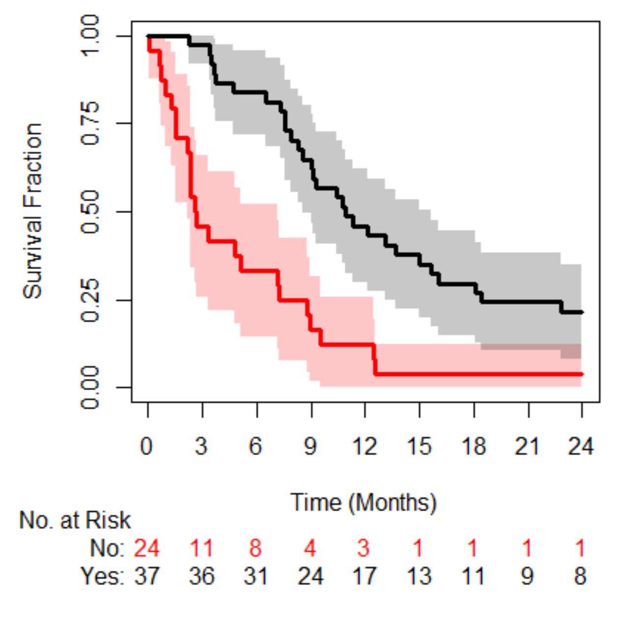
Moving on to the final question, is a patient’s risk of death the same if they have a small number of CTCs versus a large number.  In order to answer this, we need a data-set. A digitized data-set from a study in metastatic castrate resistant prostate cancer (mCRPC) will be used, the original study can be read about here and the data-set can be found here with some example code going through the analysis below. The cohort contains 156 patients, 94 deaths with a median survival time of 21 months (95% confidence interval was 16-24 months).

In mCRPC the Magic Number is 5. If patients have less than 5 their prognosis is better than those that have 5 or more.  So, the question we are interested in, is the prognosis of a patient with 5 CTCs different from someone who has 100 CTCs?

Below is a figure of the distribution of CTC counts in this cohort of patients. You will notice that there is a large proportion of patients with 0 or 1 values, 38/156 and 15/156 respectively.  There is generally quite a wide range of values.

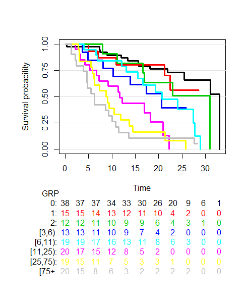
The next plot we shall look at is one of survival probability over time of groups of patients generated by splitting the distribution of CTC counts into 8 groups (generated by looking at the 12.5th, 25th, 37.5th, 50th, 62.5th, 75th and 87.5th percentiles), see below.

The plot shows that as a patient’s CTC count increases their prognosis worsens. Imagine a patient with a CTC count of 5 (located in the dark blue group) versus a patient with CTC count 100 (located in the grey group). It’s clear the prognosis of these two groups is different.  Yet if we use the Magic Number 5 both patients will be told they have the same prognosis, which is clearly incorrect. Let’s explore this further and move away from categorising CTC counts…

An alternative way of visualizing the data can be obtained by plotting the log(Hazard Ratio) as a function of CTC counts according to the groups, see plot below.

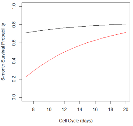
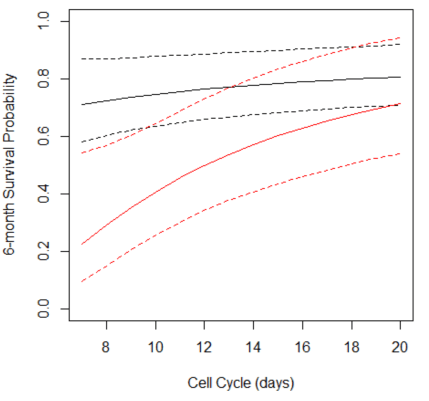
We can see that the relationship is not quite linear nor does there appear to be an obvious cut-point. In fact, the relationship looks rather sigmoidal, like a Hill function (or to pharmacologists an Emax model). In fact we can fit a Hill function, Hmax/(1+(CTC50/CTC)^h), to the data as shown below.  (Hmax, CTC50 and h are parameters that need to be estimated.)

So how does this compare with using the Magic Number 5? In the code, see here, you will see a comparison of model likelihoods which highlights, unsurprisingly, that a sigmoid model better describes the data than using the magic number 5 as well as many other discrimination indexes.

This brief analysis clearly shows using a Magic Number approach to analysing the correlation between CTC counts and prognosis is clearly not in the patient’s favour.  Imagine if this was your data, let’s stop dichotomania!

Ignoring Uncertainty in Collaborative Conceptual Models

This blog-post relates to a meeting entitled “Modelling Challenges in Cancer and Immunology: one-day meeting of LMS MiLS”. The meeting was held at the beautiful location of Kings College London. The talks were a mix of mathematical modelling and experimental – with most combining the two disciplines together. The purpose of the meeting was to foster new collaborations between the people at the meeting.

Collaboration is a key aspect of this intersection between cancer and immunology since no one person can truly have a complete understanding of both fields, and nor can they possess all the skill-sets needed. When collaborating though each of us trusts the experts in their respective fields to bring conceptual models to the table for discussion. It’s very important to understand how these conceptual models have developed over time.

Every scientist has developed their knowledge via their own interpretation of the data/evidence over their careers. However, the uncertainty in the data/evidence used to make statements such as A interacts with B is rarely mentioned.

For many scientists, null hypothesis testing has been used to help them develop “knowledge” within a field. This “knowledge”, throughout that scientists’ career, has been typically gained by using a p-value threshold of 0.05 with very little consideration of the size of effect or what the test actually means.

For example, at the meeting mentioned there was a stream of statements, which were made to sound like facts, on correlations which were tenuous at best simply because the p-value was below 0.05. An example is the figure below, where the data has a correlation coefficient of 0.22 (“p<0.05”). The scientist from this point onwards will say A correlates with B consigning the noise/variability to history.

Could it be that the conceptual models we discuss are based on decades of analyses described as above? I would argue this is often the case and was certainly present at the meeting. This may argue for having very large collaboration groups and looking for consensus, however being precisely biased is in no-one’s best interests!

Perhaps the better alternative is to teach uncertainty concepts at a far earlier stage in a scientist’s career. That is introducing Bayesian statistics (see blog-post on Bayesian Opinionater) earlier rather than entraining scientists into null-hypothesis testing.  This would generally improve the scientific process – and will probably reduce my blood pressure when attending meetings like this one.


The Minsky Model

The Minsky model was developed by Steve Keen as a simple macroeconomic model that illustrates some of the insights of Hyman Minsky. The model takes as its starting point Goodwin’s growth cycle model (Goodwin, 1967), which can be expressed as differential equations in the employment rate and the wage share of output.

The equations for Goodwin’s model are determined by assuming simple linear relationships between the variables (see Keen’s paper for details). Changes in real wages are linked to the employment rate via the Phillips curve. Output is assumed to be a linear function of capital stock, investment is equal to profit, and the rate of change of capital stock equals investment minus depreciation.

The equations in employment rate and wage share of output turn out to be none other than the Lotka–Volterra equations which are used in biology to model predator-prey interaction. As employment rises from a low level (like a rabbit population), wages begin to climb (foxes), until wages becomes too high, at which point employment declines, followed by wages, and so on in a repeating limit cycle.

Limit cycle for wage share (w_fn) and employment (lambda) in Goodwin model

In order to incorporate Minsky’s insights concerning the role of debt finance, a first step is to note that when profit’s share of output is high, firms will borrow to invest. Therefore the assumption that investment equals profit is replaced by a nonlinear function for investment. Similarly the linear Phillips curve is replaced by a more realistic nonlinear relation (in both cases, a generalised exponential curve is used). The equation for profit is modified to include interest payments on the debt. Finally the rate of change of debt is set equal to investment minus profit.

Together, these changes mean that the simple limit cycle behavior of the Goodwin model becomes much more complex, and capable of modelling the kind of nonlinear, debt-fueled behavior that (as Minsky showed) characterises the real economy. A separate equation also accounts for the adjustment of the price level, which converges to a markup over the monetary cost of production.

So how realistic is this model? The idea that employment level and wages are in a simple (linear or nonlinear) kind of predator-prey relation seems problematic, especially given that in recent decades real wages in many countries have hardly budged, regardless of employment level. Similarly the notion of a constant linear “accelerator” relating output to capital stock seems a little simplistic. Of course, as in systems biology, any systems dynamics model of the economy has to make such compromises, because otherwise the model becomes impossible to parameterise. As always, the model is best seen as a patch which captures some aspects of the underlying dynamics.

In order to experiment with the model, I coded it up as a Shiny app. The model has rate equations for the following variables: capital K, population N, productivity a, wage rate w, debt D, and price level P. (The model can also be run using Keen’s Minsky software.) Keen also has a version that includes an explicit monetary sector (see reference), which adds a few more equations and more complexity. At that point though I might be tempted to look at simpler models of particular subsets of the economy.

Screenshot of Minsky app

References
Goodwin, Richard, 1967. A growth cycle. In: Feinstein, C.H. (Ed.), Socialism, Capitalism and Economic Growth. Cambridge University Press, Cambridge, 54–58.
Keen, S. (2013). A monetary Minsky model of the Great Moderation and the Great Recession. Journal of Economic Behavior and Organization, 86, 221-235.

Radiomics meet Action-Potential-Omics and Recidivism-Omics

In previous blog-posts we have discussed how simple models can perform just as well if not better than more complex ones when attempting to predict the cardiac liability of a new drug, see here and for the latest article on the matter here. One of the examples we discussed involved taking a signal, action-potential, deriving 100s of features from it and placing them into a machine learning algorithm to predict drug toxicity. This approach gave very impressive performance. However, we found that we could get the same results by simply adding/subtracting 3 numbers together!  It seems there are other examples of this nature…

A recent paper sent to me was on the topic of recidivism, see here. The paper explored how well a machine learning algorithm which uses >100 features performed compared to the general public at predicting re-offending risk.  What they found is that the general public was just as good.  They also found that the performance of the machine learning algorithm could be easily matched by a two variable model!

Let’s move back to the life-sciences and take a look at an emerging field called radiomics.  This field is in its infancy compared to the two already discussed above. In simple terms radiomics involves extracting information from an image of a tumour.  Now the obvious parameter to extract is the size of the tumour through measuring its volume, a parameter termed Gross Tumour Volume, see here for a more detailed description. In addition to this though, like in the cardiac story, you can derive many more parameters, from the imaging signal. Again similar to the cardiac story you can apply machine learning techniques on the large data-set created to predict events of interest such as patient survival.

The obvious question to ask is: what do you gain over using the original parameter that is derived, Gross Tumour Volume? Well it appears the answer is very little, see supplementary table 1 from this article here for a first example. Within the table the authors calculate the concordance index for each model. (A concordance index value of 0.5 is random chance whereas a value of 1 implies perfect association, the closer to 1 the better.) The table includes p-values as well as the concordance index, let’s ignore the p-values and focus on the size of effect. What the table shows is that tumour volume is as good as the radiomics model in 2 out of the 3 data-sets, Lung2 and H&N1, and in the 3rd, H&N2, TNM is as good as radiomics:

  TNM

(Tumour Staging)

Volume Radiomics TNM + Radiomics Volume + Radiomics
Lung2 0.60 0.63 0.65 0.64 0.65
H&N1 0.69 0.68 0.69 0.70 0.69
H&N2 0.66 0.65 0.69 0.69 0.68


They then went on and combined the radiomics model with the other two but did not compare what happens when you combine TNM and tumour volume, a 2 variable model, to all other options.  The question we should ask is why didn’t they? Also is there more evidence on this topic?

A more recent paper, see here, from within the field assessed the difference in prognostic capabilities between radiomics, genomics and the “clinical model”.  This time tumour volume was not explored, why wasn’t it? Especially given that it looked so promising in the earlier study. The “clinical model” in this case consisted of two variables, TNM and histology, given we collect so much more than this, is this really a fair representation of a “clinical model”?  The key result here was that radiomics only made a difference once you also included a genomic model too over the “clinical model” see Figure 5 in the paper. Even then the size of improvement was very small.  I wonder what the performance of a simple model that involved TNM and tumour volume would have looked like, don’t you?

Radiomics meet Recidivism-Omics and Action-Potential-Omics you have more in common with them than you realise i.e. simplicity may beat complexity yet again!

Is this the golden age for open patient level oncology data?

Over the last few years there has been a growth in databases that house individual patient data from clinical trials in Oncology.  In this blog post we will take a look at two of these databases, ProjectDataSphere and ClinicalStudyDataRequest, and discuss our own experiences of using them for research.

ProjectDataSphere houses the control arms of many phase III clinical trials. It has been used to run prediction competitions which we have discussed in a previous blog-post, see here. Gaining access to this database is rather straightforward.  A user simply fills in a form and within 24-48 hours access is granted. You can then download the data sets together with a data dictionary to help you decipher the variable codes and start your research project.  This all sounds too easy, so what’s the catch?

The main issue is being able to understand the coding of the variables, once you’ve deciphered what they mean it’s pretty straightforward to begin a project.  It does help if you have had experience working with such data-sets before. An example of a project that can be conducted with such data can be found here. In brief, the paper explores both a biased and un-biased correlation of tumour growth rate to survival, a topic we have blogged about before, see here.

If you want to access all arms of a clinical trial then ClinicalStudyDataRequest is for you. This is a very large database that spans many disease areas. However access to the data is not as straightforward as ProjectDataSphere.  A user must submit an analysis plan stating the research objectives, methods, relevant data-sets etc. Once the plan has been approved, which can take between 1-2 months from our experience, access is granted to the data-sets.  This access though is far more restrictive than ProjectDataSphere.  The user connects to a server where the data is stored and has to perform all analysis using the software provided, which is R with a limited number of libraries. Furthermore there is a time-restriction on how long you can have access to the data.  Therefore it really is a good idea to have every aspect of your analysis planned and ensure you have the time to complete it.

An example of a project we have undertaken using this database can be found here. In brief the paper describes how a model of tumour growth can be used to analyse the decay and growth rates of tumours under the action of three drugs that have a similar mechanism of action. A blog-post discussing the motivation behind the tumour growth model can be found here.

There are of course many databases other than the two discussed here with an oncology focus, e.g. SEER, TCGA, YODA etc. The growth in such databases clearly suggests that this may well be the golden age for patient level oncology data. Hopefully this growth in open data will also lead to a growth in knowledge.